Why stationery ads are hard to get right
Stationery is one of the most tactile things people buy online. In a shop they run a thumb along the paper, uncap a pen and scribble, unzip a pouch to see how wide it opens. An ad has a couple of seconds and a small screen to stand in for all of that, which is why a notebook photographed flat on white rarely does much on its own.
The ads above swap touch for evidence:
| What a buyer does in a shop | What the ad shows instead |
|---|---|
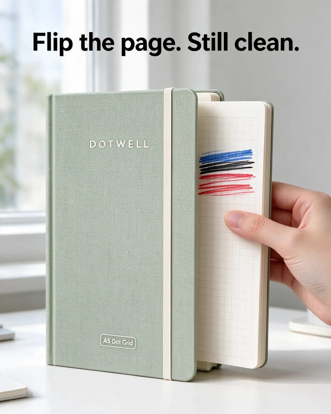
| Runs a thumb over the paper | An inked page pulled forward to show its clean reverse |
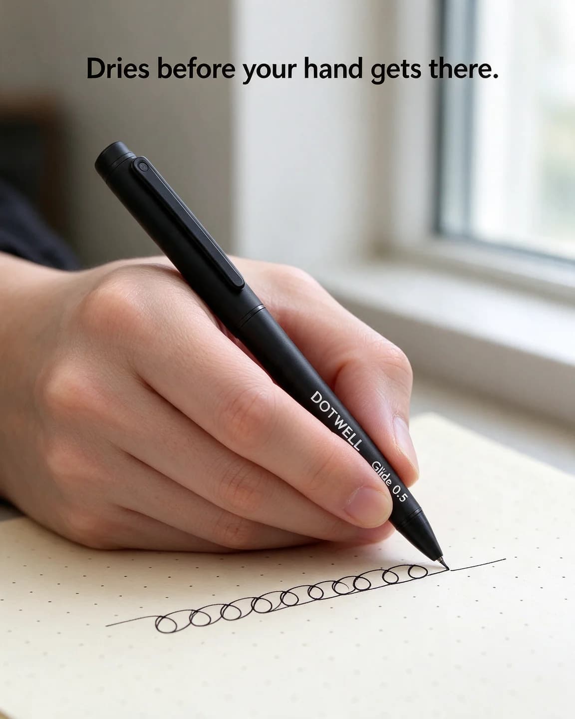
| Scribbles with the tester pen | A left hand mid-line, with no smudge behind it |
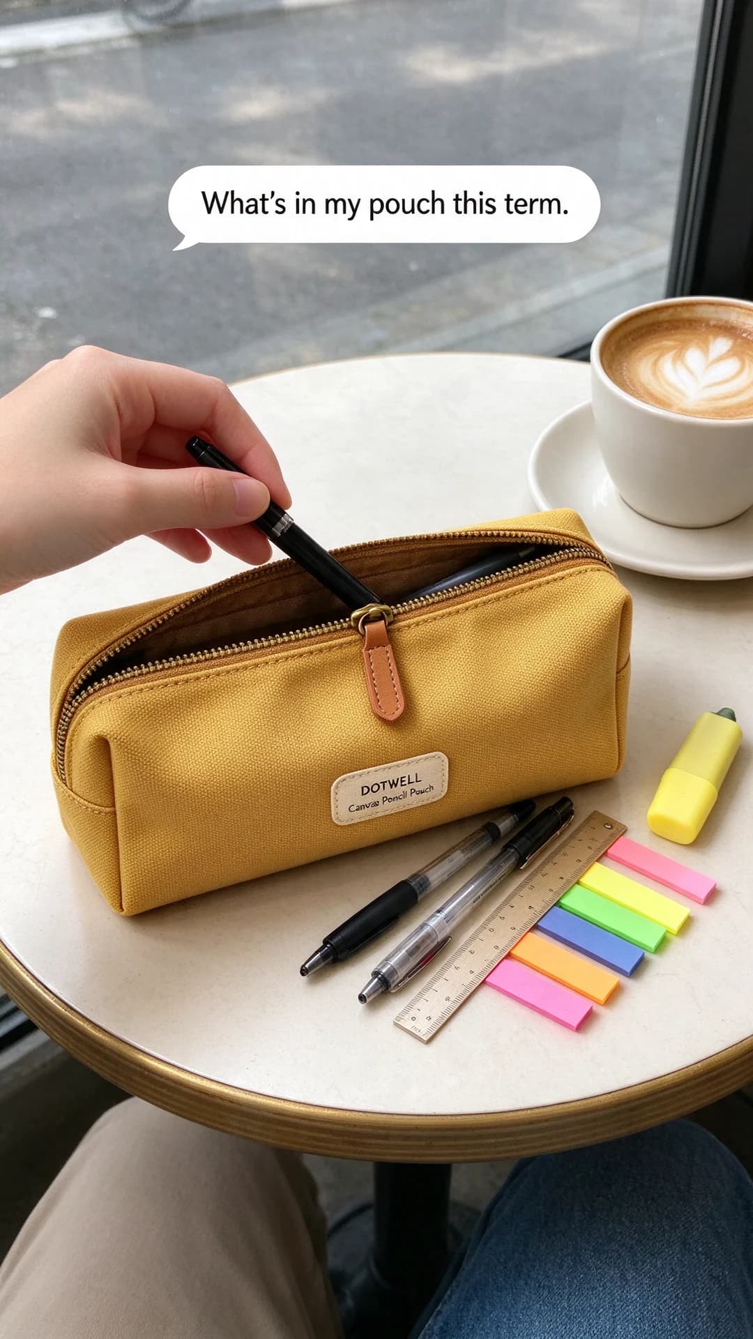
| Unzips the pouch to look inside | The pouch tipped out on a café table |
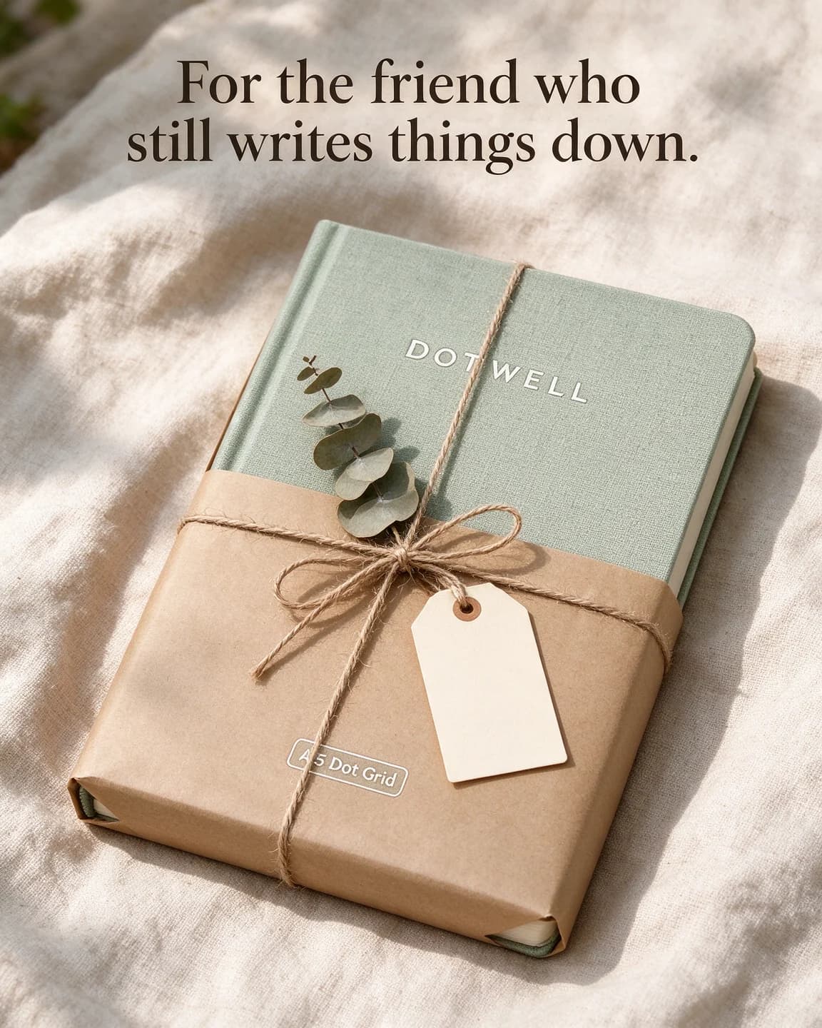
| Picks one up as a present | A notebook half-wrapped in kraft paper |
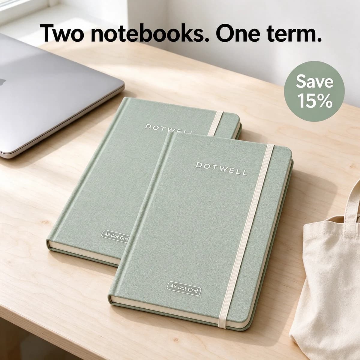
| Checks how long it lasts | A two-pack framed around one term |
When you plan a stationery batch, ask the same of every product: what would a customer check in the shop, and which single photo shows that check?
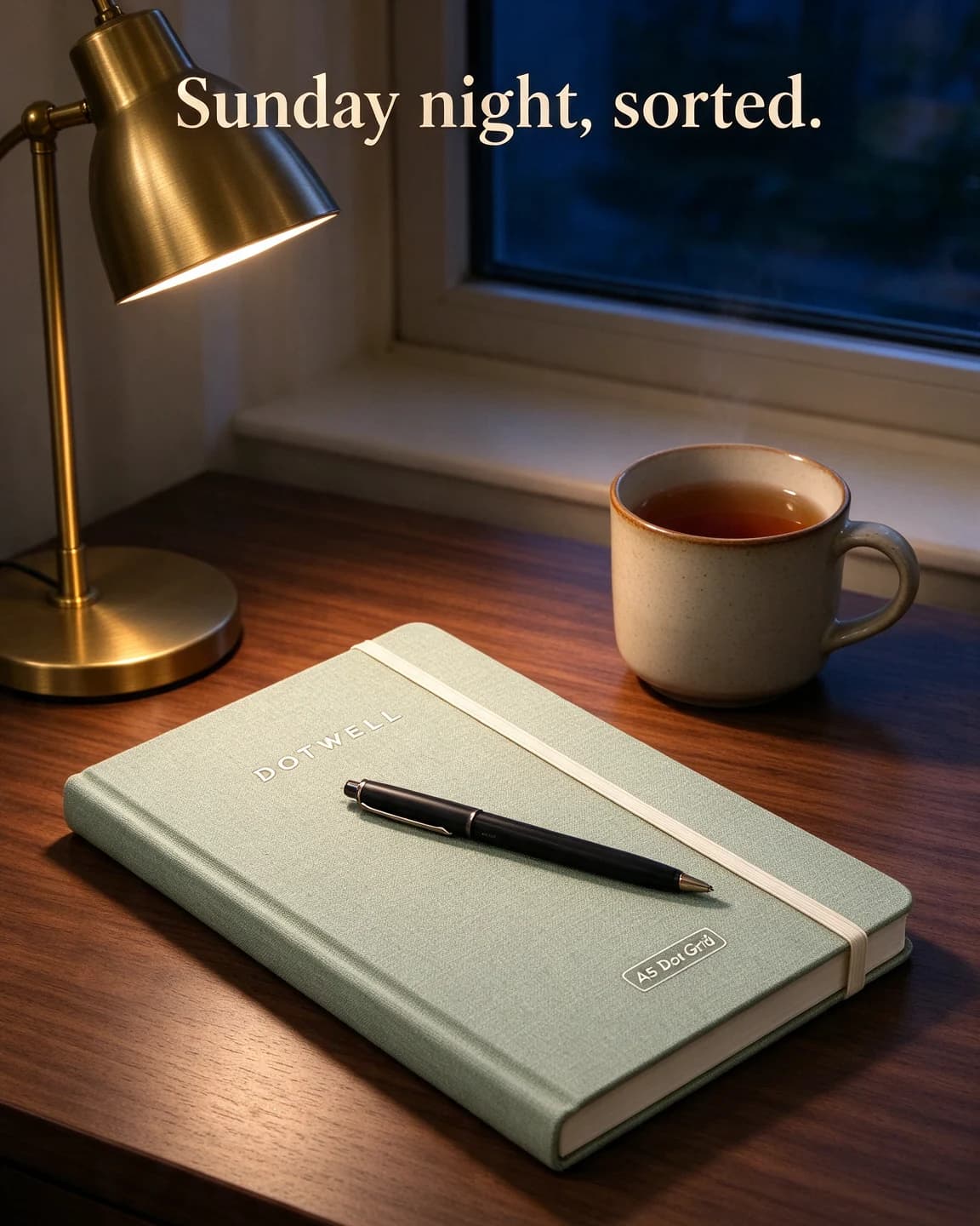
There's a second job, which is selling the habit around the object. A good notebook is bought for a routine: the Sunday planning session, the morning pages, the meeting notes that finally live in one place. Ads that show the routine give the viewer a reason to want the notebook now, not whenever the old one runs out.
Shots that sell notebooks, pens and pouches
Notebooks
Show the cover once, then show what it's like inside. Close-ups of the dot grid, the lay-flat spine and the page edge carry more information than a hero shot. If your paper is heavy, say the weight in gsm, because the buyers who care look for that number first. Keep pages blank or lightly doodled in AI-made images, since generated handwriting looks wrong on a second look.
Pens
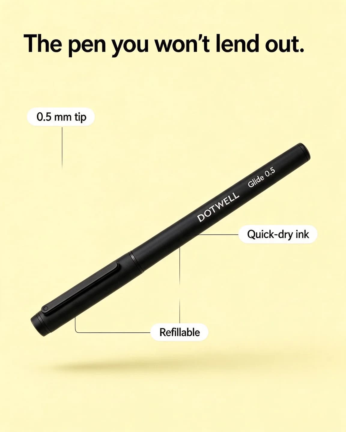
Pens are judged in use. Photograph the tip on paper, mid-line, with a hand that looks relaxed rather than posed. A macro shows the line width and the ink's sheen better than any spec, and a tight crop keeps the printed barrel in focus. A pen alone on a flat colour works as a bold-claim ad once you have one strong line to put next to it.
Pouches and cases
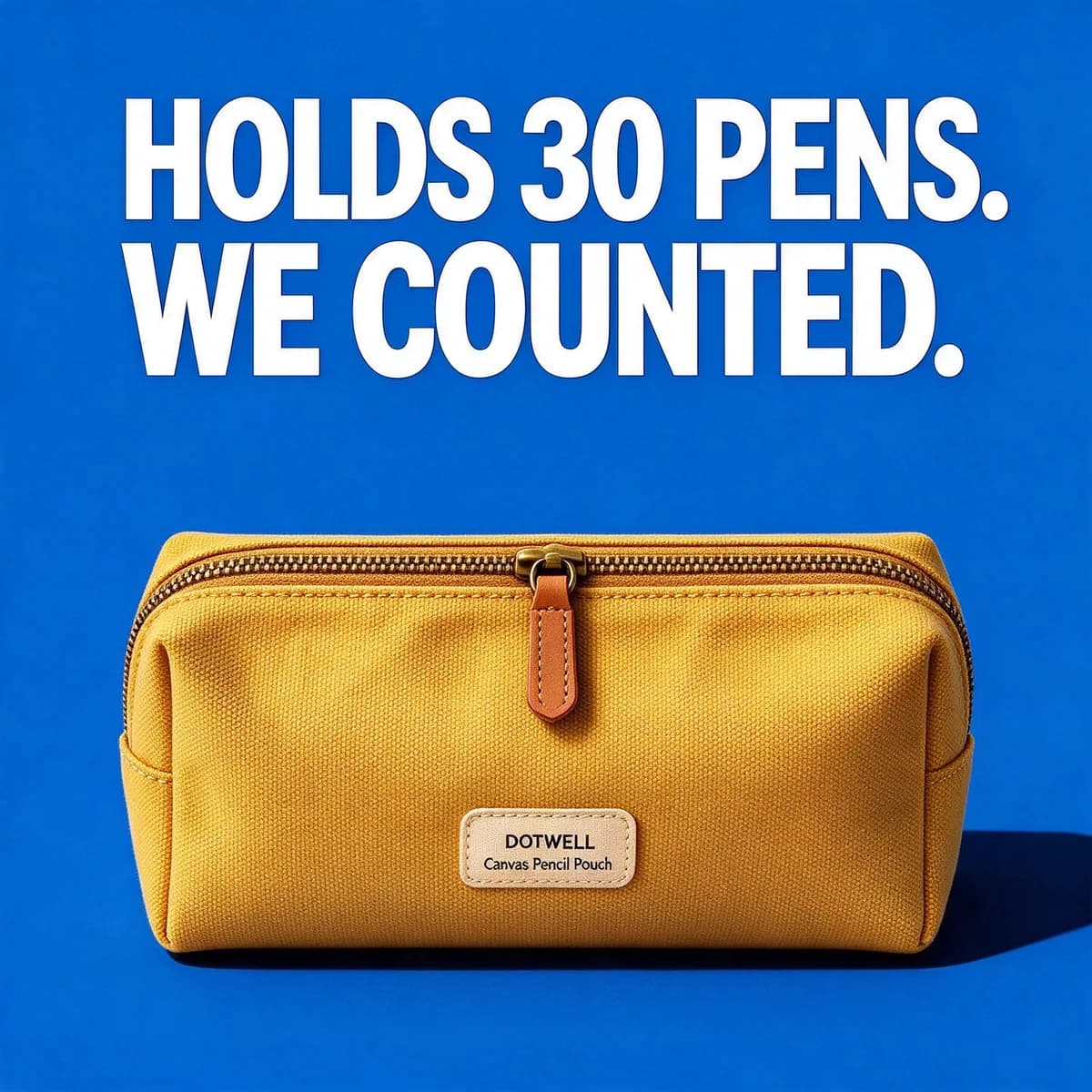
Open them. The zip, the lining and what fits inside are the selling points, and a tidy "what's in my pouch" spread does what a closed product shot can't. Use a familiar backdrop, such as a backpack, a desk or a café table, so the size reads at once.
What to test first
For a stationery brand with a few products, begin with the hero notebook or pen and five angles, two versions of each:
- Paper or ink proof, such as the held-up page or the smudge test.
- Ritual, the calm Sunday desk or a first page.
- UGC haul, a phone-style "what's in my pouch" in 9:16.
- Bold claim, one checkable number like a gsm or a pen count.
- Gift, written about the person receiving it.
That's 10 ads, inside a single batch. Our guide on how many ad creatives to test explains how to size the test up or down. The phone-note checklist and the pouch review in the mock-ups above make a lo-fi pair to run beside the polished desk shots, and the notes app template shows how that layout is built.
Offers in stationery work best when they match how things run out. Notebooks fill up and pens run dry, so pairs and refills make more sense than a big percentage off a single item. As a worked example: two $6.20 notebooks at 15% off come to $10 instead of $12. The sticker can say "Save 15%" in every market's version of the ad, and the primary text can carry the local price. Refill packs deserve their own ad, because "refill, don't rebuy" is a reason to choose your pen that a cheaper rival can't match overnight.
Keep the calendar in view. Stationery has sharper seasons than most categories, with the start of the academic year and the turn of the calendar year at the top. Our back-to-school ad ideas cover the first. For gift seasons, the gift angle above can be reused with a new wrap and a new tag.
From one packshot to a full stationery batch
BulkAds works from one clean photo per product. The notebook on white, the pen on white, the pouch on white: that's enough to build a desk at dusk, a café table, a gift wrap or a flat colour block around each one. Every generated ad is checked against your original photo, so a cover in the wrong green or a label with an extra letter is marked in the pre-flight report before anything launches. The flat lay template and our flat lay prompts show how top-down desk scenes are put together.
Two honest limits. First, AI image models still struggle with handwriting, so any ad that depends on what's written on a page needs your own photo. Second, proof ads like the held-up page should show your real paper test, because a generated test proves nothing. Upload ad takes your own photo as it is, with your headline and primary text or a BulkAds rewrite of them, so the evidence stays real while the rest of the batch gets faster.
Your brand kit keeps claims to what your website states, such as paper weight, page count or refill size. Each image ad costs 2 credits, a batch holds up to 12, and the bulk ad launcher sends them to your Meta ad account paused, so nothing runs until you approve it.
Small details that make stationery ads feel premium
- Natural light from one side. It brings out paper texture and the weave of linen covers.
- Real desks, lived in a little. A mug ring or a bent corner reads as honest. A spotless white desk reads as a catalogue.
- One product per frame where you can. A whole collection in one shot turns into clutter at phone size.
- Backgrounds picked from the product. Use the cover or pouch colour, or its opposite, so the product stays the hero.
- Readable branding. The logo on a cover or barrel should survive a thumbnail-sized preview.
Questions people ask
What makes a good notebook ad?
One that shows what a buyer would check in a shop: the paper up close, the back of a page after ink, the spine lying flat. Pair that proof with a routine, like Sunday planning, so the viewer has a reason to start a new notebook now.
How do I show paper quality in an ad?
Show a test rather than an adjective: ink stripes on the front of a page and a clean reverse, the paper weight in gsm, a macro of the grid. Use a photo of your real test for proof ads, since a generated test page proves nothing.
Do UGC-style ads suit stationery?
Yes, because 'what's in my pouch' and desk set-ups are already familiar formats on Stories and Reels. Keep the product label readable, and don't present an AI-made scene as a real customer's post.
When should stationery brands make back-to-school ads?
Have the creative made and tested a few weeks before term starts in each market, which is April to June across much of India and August to September in the US and UK. That way the winning angles are ready when interest peaks, rather than found after it.
Is Dotwell a real brand?
No. Dotwell and its notebook, gel pen and pencil pouch are made up, and every ad on this page was generated with AI for illustration.
Keep going
- Ad templates
Flat lay ad template
The product from straight above, with the few things that tell its story
- Ad templates
Notes app ad template
A plain phone note whose last line happens to be your product
- Ad templates
Five-star review ad template
A store-style review card where the stars do the first job
- Prompt library
Flat lay prompts
Four flat lay AI image prompts shown beside the product photos they made, with notes on top-down camera wording, prop lists, light and room for a headline.
- Ad examples
Books ad examples
Book ads that sell a first line, a mood or a gift, not a blurb
- Ad examples
Art supplies ad examples
Paint and brush ads that put the stroke in the frame
Every brand on this page is fictional and every ad was made with AI for illustration — they’re examples, not case studies.
BulkAds AI is an independent product and is not affiliated with, endorsed or sponsored by Meta Platforms, Inc. Facebook and Instagram are trademarks of Meta Platforms, Inc.