


What a static ad is good at
A static ad is a single image with your copy around it: no motion, no swiping, no sound. That sounds like a limitation, and in one way it is, because everything has to land in the time it takes someone to glance at it. It's also why statics remain the workhorse of most accounts. They're the quickest format to make, the cheapest to change and the easiest to compare, since one image carries one idea.
The eight examples above each give a static one job. Match the job to what's true about your product:
| The job | Suits products that | Example above |
|---|---|---|
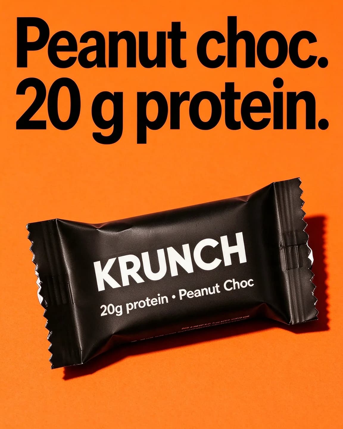
| State one fact loudly | have a number or material printed on the pack | Krunch, the protein line |
| Explain a hidden feature | look ordinary from the outside | Leafy, the three labels |
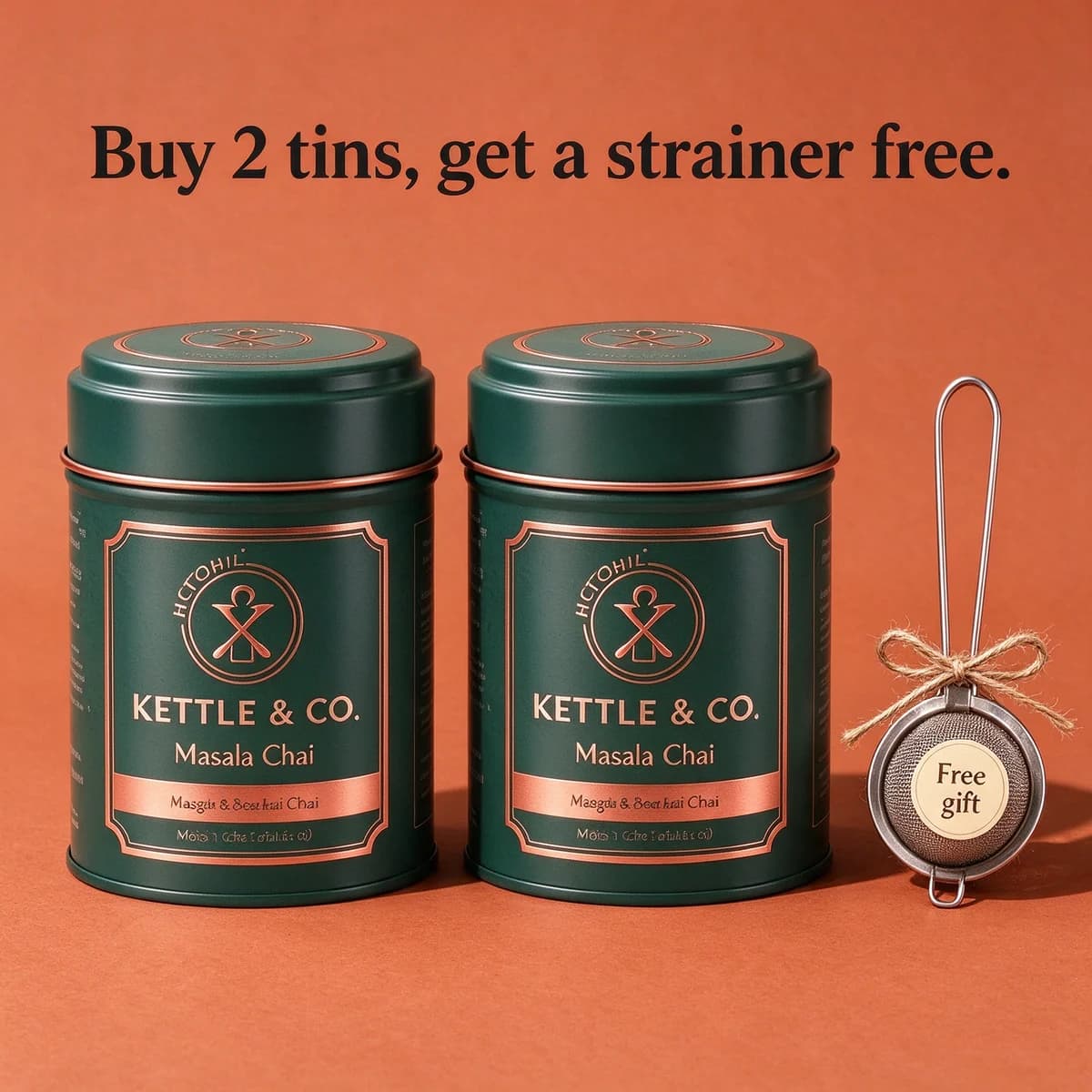
| Make an offer visible | come with a gift or a multi-buy | Kettle & Co., the free strainer |
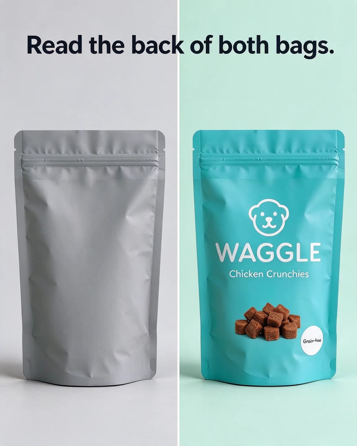
| Compare two things | win on something printed on the pack | Waggle, the back-of-pack test |
| Borrow a customer's words | sell a scent, a feel or a taste | Nook & Wick, the cabin quote |
| Let the product carry it | are bought on looks | Mira, no overlay at all |
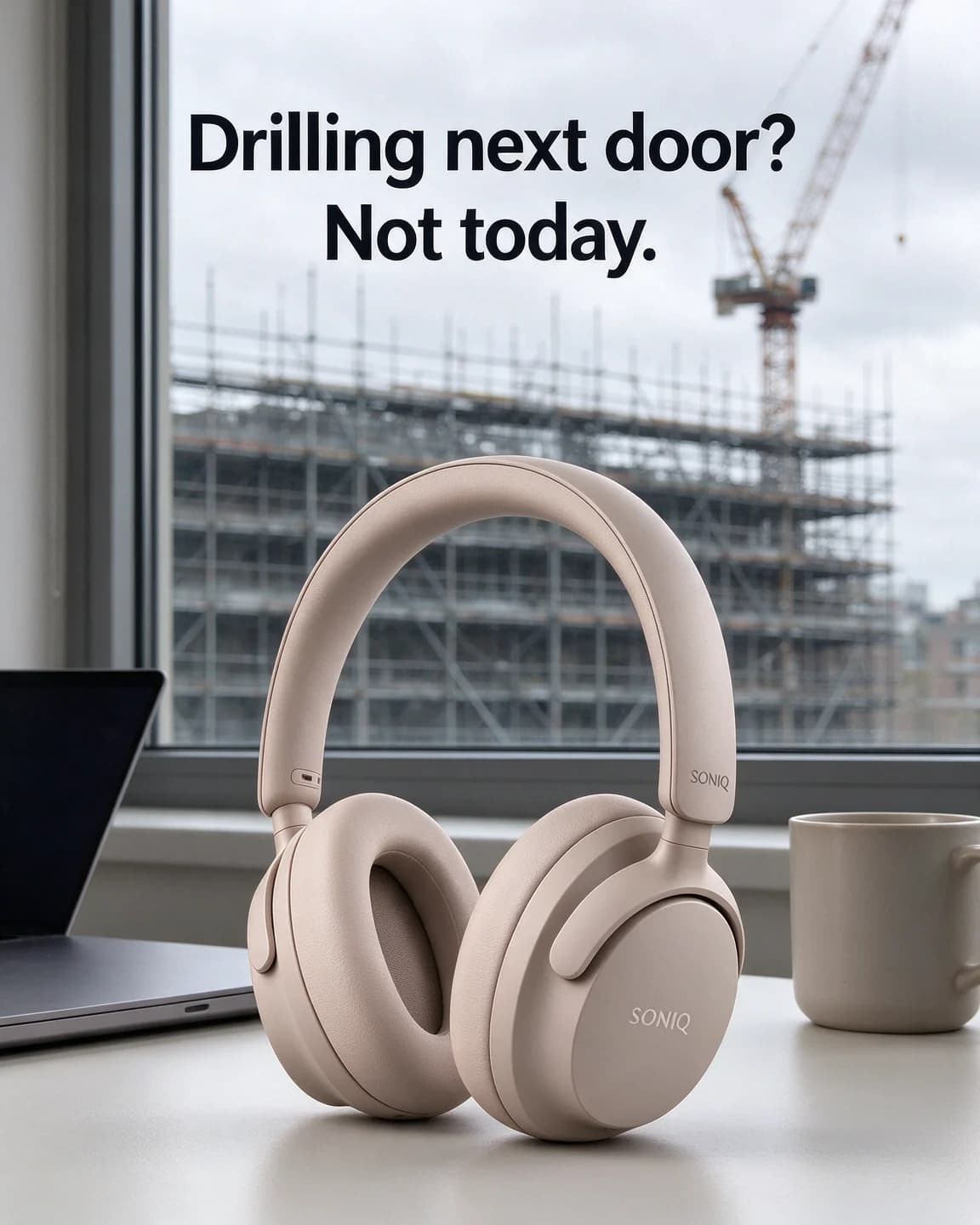
| Show the problem in the scene | end an everyday annoyance | Soniq, the scaffolding outside |
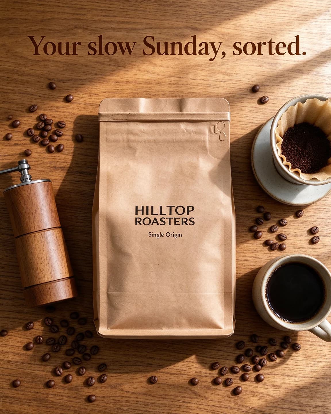
| Show the ritual | are used as part of a routine | Hilltop Roasters, the flat lay |
What statics handle badly is anything that needs time: a process, a texture in motion, a room being made over, a story with a twist. Those belong in a carousel or a Reels ad.
Build the image in the order people read it
A static usually gets one look. A useful rule of thumb is to design for three things in order: the biggest shape (normally the product), the biggest words, and whatever small detail is left. If the order on your image is different, people meet the sticker before they know what's for sale.
1. The product, big and recognisable
If someone can't tell what's being sold from a thumbnail, the headline has to do too much work. Keep the product large, sharp and facing the camera, with the label readable. A real packshot matters more here than in any other format: a static is a single frame, so a redrawn label or a wrong colour is the whole ad. That's why BulkAds builds every static around your own product photo and checks the result against it.
2. One line, short enough for a glance
The headlines above run four to seven words. If you need a second idea, it goes in the primary text, not on the image. As of October 2026, Meta's own photo ad format page (opens in a new tab) gives similar advice: ask people to look at one thing, and if you're cramming several things into one image, consider a carousel or a video instead. The same page warns that too much copy on an image is distracting and can lead to the ad being shown to fewer people.
3. Contrast before decoration
A flat background in a brand colour, a hard shadow and dark type is a plain recipe, and it works because nothing competes with the product and the words. Texture, props and scenes earn their place when they say something, like the scaffolding outside the Soniq window or the brewing kit around the Hilltop bag. As filler, they only slow the reader down.
Leave room for the placements
A static rarely runs in only one place. The same image can be shown in feeds, Stories and Reels, and as of October 2026 Meta's Reels ads page (opens in a new tab) says its image expansion feature can use generative AI to extend an image to the 9:16 Reels frame. You don't choose what gets painted in, so compose with a margin: product and text in the middle, quiet background at the edges. The free safe zone checker shows what the interface covers on a vertical version. When a vertical placement really matters, make a proper 9:16 static instead of relying on the stretch.
How BulkAds makes static ads
Statics are where BulkAds starts. You pick a product from your brand kit, choose how many ads you want (up to 12 in a batch) and a shape, 1:1, 4:5 or 9:16, and the AI ad generator gives each ad its own angle: a bold claim, a moment of use, an offer, a UGC-style shot and so on. Want a batch of callouts or comparisons only? Say so in your own instructions and the batch follows them. The batch reads your colours, fonts, voice and the proof points you've approved, so the claims on the image are ones you can back up.
Every ad then passes a pre-flight check before you see it. Does the product match your real photo? Is every word on the image spelt correctly? Does it fit your brand, is the composition clean, and is there a likely policy problem such as a fake button? You keep the good ones, regenerate a single element of the nearly-right ones and bin the rest. Each ad also arrives with a headline, primary text and description written for its own angle, so the words under the image don't argue with the words on it.
When the set is ready, the bulk ad launcher puts every static into your own Meta ad account, paused, with UTM tags and readable names. Their results sync back into BulkAds. If you hand the statics to Autopilot instead, it launches them as its own test, stops the ones that don't sell and drafts fresh variants of the ones that do, inside your caps.
A worked example: twelve statics for one product
Say you sell a self-watering planter and want to learn whether people buy it for the convenience, the look or the price. You'd want a couple of honest attempts at each idea: two bold claims, two callouts, two lifestyle scenes, two offers, two review quotes and two image-only heroes. That's twelve statics.
Now say a freelance designer charges $12 per finished static. Twelve come to $148 before any of them has run, and the second round after the first results costs the same again. Made as one BulkAds batch from a single packshot, the same twelve use 24 credits (2 per image ad), and the plans that cover them are on the pricing page. The guide to cost per ad creative runs the comparison in more detail, including the review time you still spend either way.
The point isn't that designers cost too much. Statics get cheaper to learn from the more of them you make, because every extra angle answers another question about why people buy.
When a static has done its job
A static that sells is a brief for the next formats. Keep its line and turn it into a short video ad for Reels, or spread its idea across cards if it has more than one thing to say. Keep a few statics running even when video is winning, since they're the fastest way to try a new angle before you invest in building it out. Static vs video ads covers how the two formats work together, and the ad design checklist is a quick pass to run on any static before launch.
Questions people ask
What is a static ad?
A static ad is a single still image with copy around it: a photo, a designed layout or a text-led graphic. It has no motion or sound, so the image itself has to stop the scroll and make its point in one look.
Do static ads still work in 2026?
Yes, as one part of a mix. Statics are the fastest and cheapest format to make and change, which makes them the natural place to test new angles. Video and carousels can then build on the angles that win. Judge them on sales, not on how simple they look.
How much text should a static ad have?
As little as the idea needs: usually one short headline and perhaps a small sticker. As of October 2026, Meta's photo ad page warns that too much copy can lead to an ad being shown to fewer people, so the detail belongs in the primary text.
Can I use my own product photo as a static ad?
Yes. In BulkAds you can upload a photo exactly as it is with Upload ad, add its headline and primary text (BulkAds can rewrite them) and launch it, or place the packshot into new scenes and layouts. Either way, start from a sharp, evenly lit photo with a readable label.
Are Krunch, Leafy, Waggle and the other brands real?
No. Every brand on this page is fictional, and each static was made with AI to illustrate the layout.
Keep going
- Features
AI ad generator
On-brand image ads in batches of up to 12
- Guides
Static vs video ads: which to make, and when
Statics are cheap to make and quick to test, video earns its place in Reels and Stories. An honest comparison, the metrics for each and a plan that uses both.
- Guides
The ad design checklist: 24 checks before an ad goes live
Four tests every ad should pass at phone size, turned into 24 quick checks with the reason behind each one, plus a worked review of three ads from one batch.
- Ad templates
Bold claim ad template
One provable fact in giant type, on one flat colour
- Ad templates
Feature callout ad template
Your product in the middle, short labels pointing at what matters
- Ad templates
Us vs them ad template
Two matched columns, one obvious choice — against a category
Every brand on this page is fictional and every ad was made with AI for illustration — they’re examples, not case studies.
BulkAds AI is an independent product and is not affiliated with, endorsed or sponsored by Meta Platforms, Inc. Facebook and Instagram are trademarks of Meta Platforms, Inc.