
What art supply ads have to prove
Every painter knows the gap between a tube on a shelf and paint on paper. A colour can look rich in the pan and dull in a wash, and a brush can look fine in its sleeve and splay on the first stroke. So an art supplies ad that shows only the product on white asks the viewer to trust exactly what experience has taught them not to.
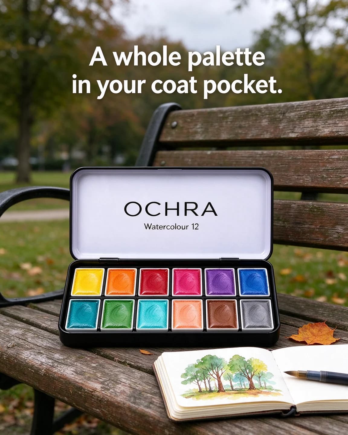
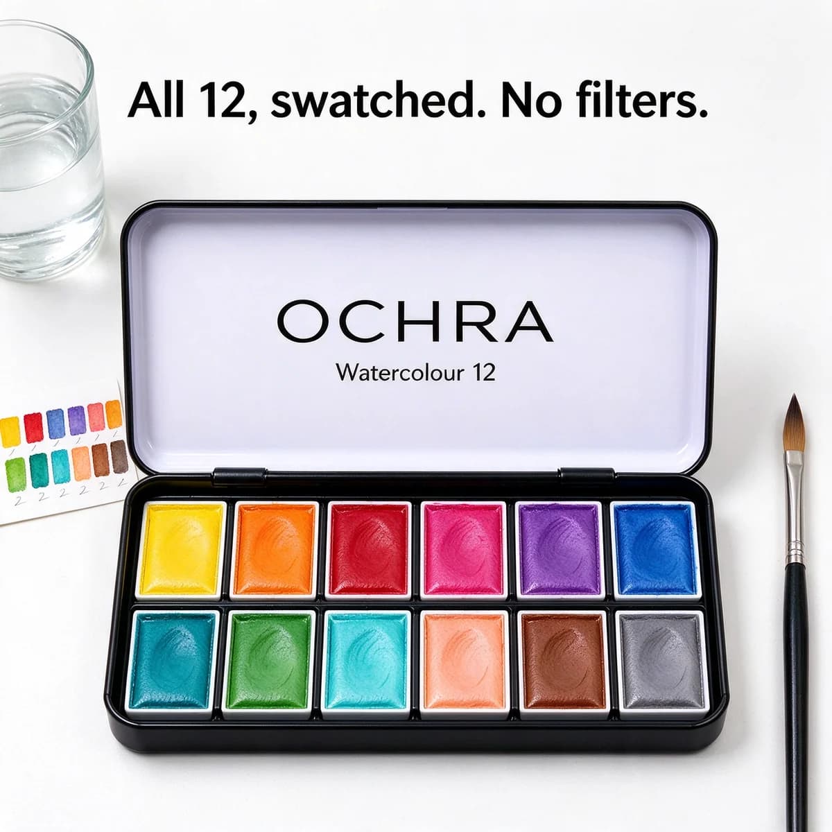
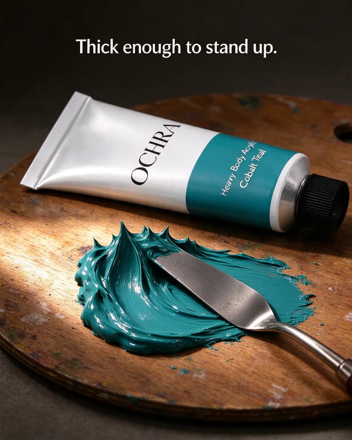
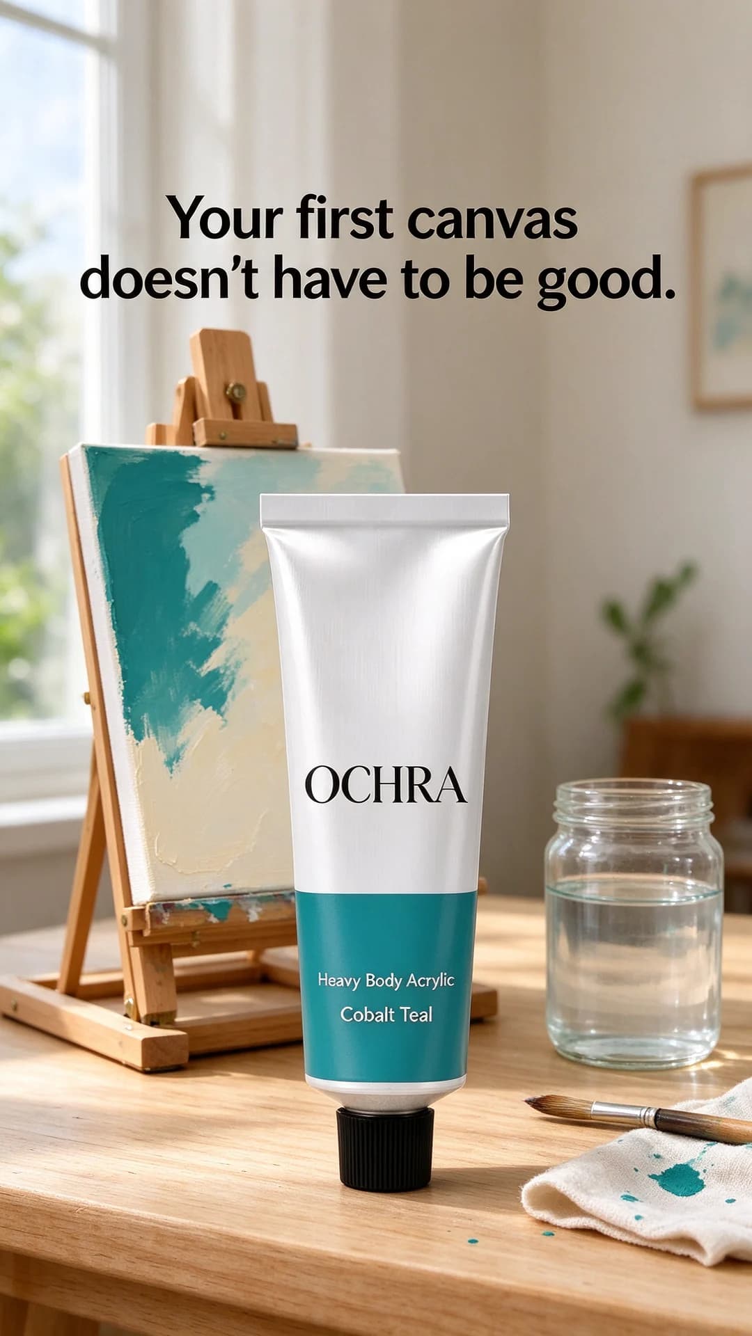
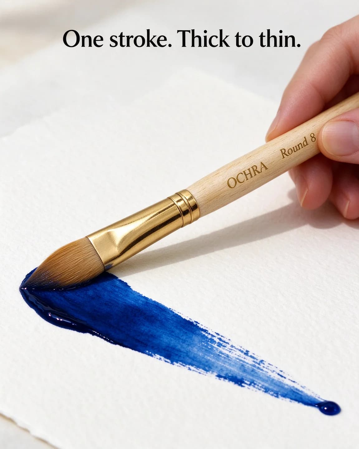
The ads above put the result in the frame. A single tapering stroke shows the brush. A palette knife lifting peaks shows the acrylic's body. A painted swatch card shows the tin's twelve colours as they look on paper. Even the beginner ad shows a finished canvas, loose and modest, so the viewer can see what an afternoon with the paint might produce.
Two audiences, two kinds of ad
Art supplies sell to two groups who want almost opposite things from an ad.
Experienced painters read labels. They want the pigment, the lightfastness and the paper the swatch was painted on, and they spot a filtered colour instantly. For them the label is the feature, which is why the comparison and callout mock-ups above list what's printed on the tube rather than how it makes anyone feel. Proof shots, macro strokes and honest swatches belong here.
Beginners and returners worry about something else: whether they'll be any good. They respond to small canvases, short sessions and permission to make something imperfect. "Your first canvas doesn't have to be good" speaks to them, and a pigment code would mean little.
Run both kinds in the same test, then read the results separately. If the beginner ads sell and the label ads don't, your buyers are telling you who they are, and the next batch should lean that way.
Shots that sell paint, pans and brushes
Watercolour sets
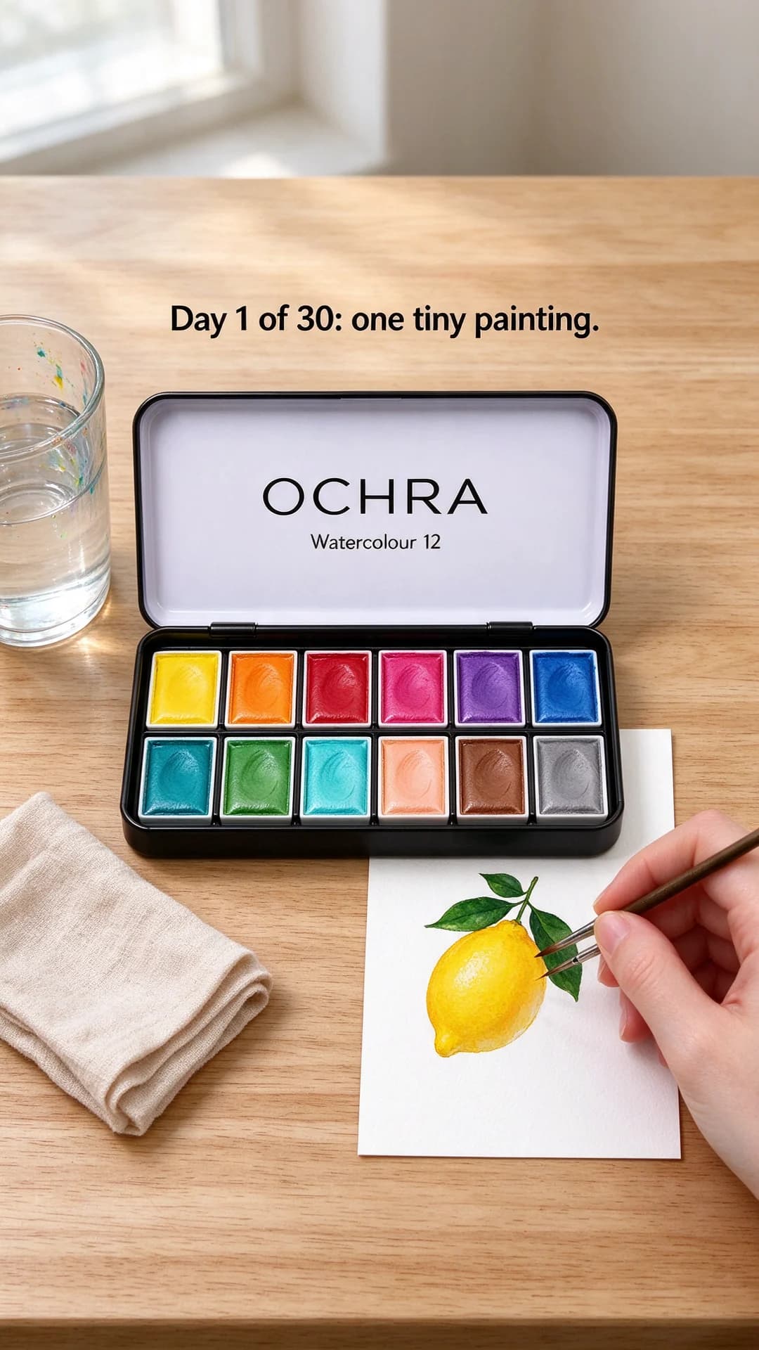
Open the tin. Show the pans, then show them on paper: a swatch card, a quick sketch, a sky in progress. Portable sets need something for scale, such as a coat pocket, a park bench or a hand. Use daylight, because watercolour swatches lose their character under warm indoor bulbs.
Acrylics, gouache and oils in tubes
Squeeze some out. A curl of paint on a palette, peaks raised by a knife, or one bold brushstroke behind the tube tells a painter about consistency and colour in a single frame. Side light picks up texture, and a darker backdrop lets bright colours glow. A new-colour ad works best with one shade and one stroke, not a rainbow.
Brushes
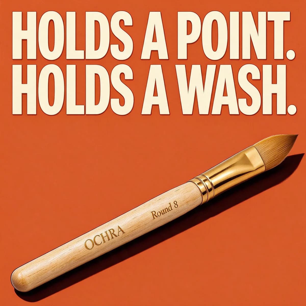
Brushes are judged on the stroke. A macro of a loaded brush laying down a line that swells and tapers is the core shot. For flats and filberts, show the crisp edge instead. If your brushes are synthetic, say so plainly in the copy rather than letting the photo imply natural hair.
What to test first
Take one hero product and five angles, two versions of each:
- Stroke or texture proof, the macro shot.
- Honest colour, a real swatch card in daylight.
- Beginner permission, a modest finished piece and a reassuring line.
- Out in the world, a bench, a café table, a train window.
- Series, a "Day 1 of 30" frame you can repeat.
Ten ads fit in one batch. For a price angle, cost per colour can be more persuasive than the sticker price of a set. As a worked example: a 12-pan tin at $20 works out at about $1.65 a colour, a line worth testing in the primary text against a plain "12 colours" headline. Our guide on how many ad creatives to test covers when to widen the test.
The series angle has a production bonus. Once a "Day 1" ad finds its audience, the next ones can be written as instructions, for example "same overhead table and morning light, headline Day 2 of 30, a single pear", or made as variants of the winning ad itself. Keep the frame identical and change only the subject, so the series is recognisable in a feed before anyone reads the headline. Our guide to iterating on a winning ad covers how far to push each new version.
Making art supply ads from one product photo
BulkAds builds every scene from your own packshot: the tin on white becomes the tin on a park bench, and the tube on white becomes the tube beside a palette of thick paint. Each ad is checked against your original photo, so a tube with the wrong band colour or a misspelled label is marked in the pre-flight report before anything launches. Your brand kit holds the facts your site states, such as pigment information, tube size or the number of pans, and the copy draws on those instead of inventing grades or ratings.
Be clear about the part AI makes up. The strokes, swatches and paintings around your product are generated, not painted with your paint. That's fine for mood and layout, and wrong for any ad that claims colour accuracy. For those, use your own photo of a real swatch card or stroke, which you can upload with Upload ad and launch as it is, with your own copy or a BulkAds rewrite of it. The how-to demo template suits real process shots, and the handmade crafts ad examples cover the finished-piece side of the craft world.
A batch holds up to 12 ads in 1:1, 4:5 or 9:16, and each image ad costs 2 credits. Winners can become short video ads, where a wash spreading across wet paper does what no still can. The bulk ad launcher sends the batch to your Meta ad account paused, so you check every ad before it spends.
Small choices that help art supply ads
- Daylight for colour, side light for texture. Choose by what the ad is proving.
- Real paper texture. Cold-press grain or canvas weave tells painters the surface, which changes how the colour reads.
- Modest artwork. A loose study persuades more than a gallery piece, because it looks like something the buyer could make.
- Mess in moderation. A water jar and a paint-stained rag say "used". A flooded table says "hassle".
Questions people ask
What should an art supplies ad show?
The result of using the product: a stroke, a swatch, a curl of paint, a modest finished piece. A tube or tin on white tells painters very little, so put the paint on paper in at least one ad for every product.
Can I call my paints non-toxic in ads?
Only if you can back it up. In the US, ACMI's AP seal marks art materials certified to contain nothing in amounts toxic or harmful to people, children included, and those products are labelled under ASTM D 4236 and the Labeling of Hazardous Art Materials Act (ACMI art materials safety page, checked October 2026). Other markets have their own rules, so check each one you sell in before the claim goes into an ad.
Is it fine to use AI-made artwork in art supply ads?
For mood and layout, yes, as long as the artwork is achievable with the product and doesn't imitate a living artist. For any ad that claims colour accuracy or performance, use a photo of a real swatch or stroke made with your own product.
Which format works best for paint and brush ads?
4:5 stills for proof shots like strokes and swatches, 9:16 for process and challenge series, and short videos once a still wins, because a spreading wash or a loaded brush in motion shows behaviour a still can only hint at.
Is Ochra a real brand?
No. Ochra and its watercolour tin, acrylic tube and brush are fictional, and every ad on this page was made with AI for illustration.
Keep going
- Features
Product photo ads
Your real packshot, in every scene
- Ad templates
How-to demo ad template
Numbered steps that show the product being used, start to finish
- Ad templates
Ingredient breakdown ad template
The pack in the middle, each key ingredient named with its amount
- Ad templates
Comparison chart ad template
Labelled rows, the same measure on each side, numbers you can check
- Ad examples
Stationery ad examples
Notebook, pen and pouch ads that show the paper test, not just the cover
- Ad examples
Handmade crafts ad examples
Craft ads that sell the hands, the hours and the one-of-a-kind finish
Every brand on this page is fictional and every ad was made with AI for illustration — they’re examples, not case studies.
BulkAds AI is an independent product and is not affiliated with, endorsed or sponsored by Meta Platforms, Inc. Facebook and Instagram are trademarks of Meta Platforms, Inc.