



Ad examples

Carousel ad examples: 8 first cards that make people swipe

A carousel ad is several cards in one ad that people swipe through, and most of the work happens on card one. These eight carousels for fictional brands are shown by their first card, each with its hook, its angle, what the next cards hold and why the structure suits the product.

8 ads2 live templates15 hooks

The swipe file

Each ad with its angle, its hook and why it works. Every brand is fictional. The ads were made with AI to show the idea.

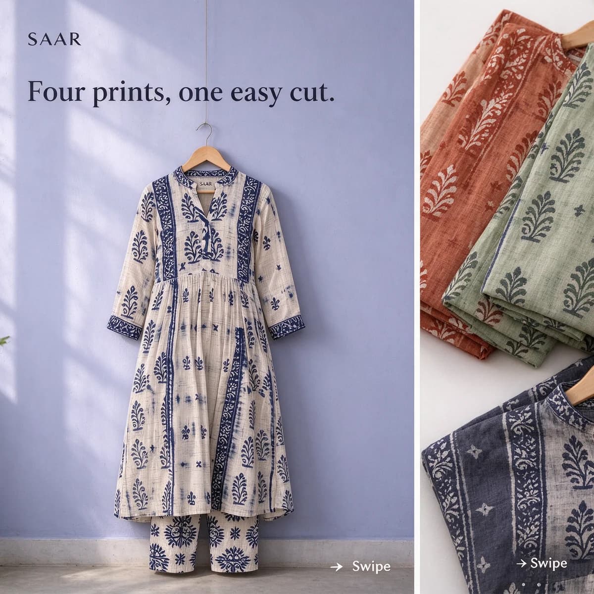
A white-and-indigo Saar block-print kurta on a wooden hanger against a pale indigo wall, the folded edges of three more kurtas peeking in from the right, headline "Four prints, one easy cut." and a small "Swipe" arrow

SaarProduct rangeCarousel · card 1 of 5 · 1:1

“Four prints, one easy cut.”

Card one says how many choices are coming, so swiping feels like browsing rather than effort, and the folded kurtas cut off at the edge show there's more to see. Cards two to four give each other print the same hanger and wall, and card five offers any two together.

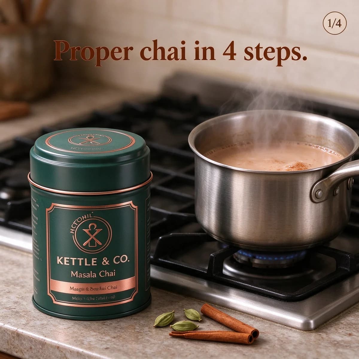
A Kettle & Co. Masala Chai tin beside a small steel saucepan of simmering milky chai on a gas stove, headline "Proper chai in 4 steps." and a "1/4" counter in the corner

Kettle & Co.Steps in orderCarousel · card 1 of 4 · 1:1

“Proper chai in 4 steps.”

A numbered promise tells people exactly how long the carousel is, and the counter shows where they are. The tin stays in every step card (boil, add the tea, simmer with milk, strain), so the product is part of the method rather than a logo tacked on at the end.

The left end of a long sunny wooden shelf with a Leafy terracotta planter holding a monstera, books and a trailing plant running off the right edge, headline "Swipe along the shelf."

LeafyPanoramaCarousel · card 1 of 3 · 1:1

“Swipe along the shelf.”

One wide photo cut into three cards makes the swipe feel continuous, because the shelf keeps going past the right edge. It only works if the cards stay in order, so automatic card ordering must be off, and each seam needs to land somewhere forgiving, like the gap between two books.

Soniq headphones on a desk in a busy open-plan office with blurred colleagues seen from behind and a desk phone lighting up, headline "Open-plan office, 11 am."

SoniqStory in cardsCarousel · card 1 of 4 · 1:1

“Open-plan office, 11 am.”

A time and a place set a scene anyone who has worked in an open office knows, and the next cards play it out: the ringing phones, the headphones going on, a quiet afternoon. Curiosity about what happens next carries the swipe, so the product only takes over on card three.

A beagle sitting very upright on a sunny kitchen floor, staring up at a teal Waggle Chicken Crunchies pouch held in a hand, headline "4 reasons dogs sit for these."

WaggleReasons, one per cardCarousel · card 1 of 5 · 1:1

“4 reasons dogs sit for these.”

The sitting dog is the first reason, before anyone reads a word. Each following card makes one point with one picture (the grain-free badge already on the pouch, the zip top, the small pieces for training), so nobody has to read a paragraph to get the whole case.

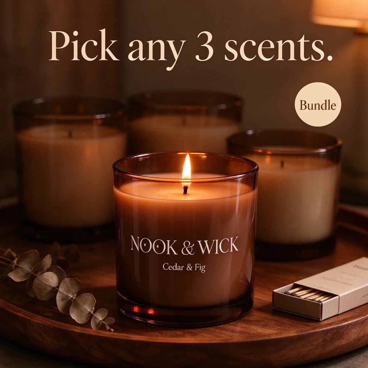
A lit Nook & Wick Cedar & Fig candle at the front of a wooden tray with two more amber jar candles behind it, headline "Pick any 3 scents." and a small "Bundle" sticker

Nook & WickBuild your setCarousel · card 1 of 6 · 1:1

“Pick any 3 scents.”

Turning a bundle into a choice makes the carousel feel like browsing a shelf in a shop. Cards two to five each show one scent with its own link, and the last card repeats the bundle, so people who have picked their favourites have somewhere to go.

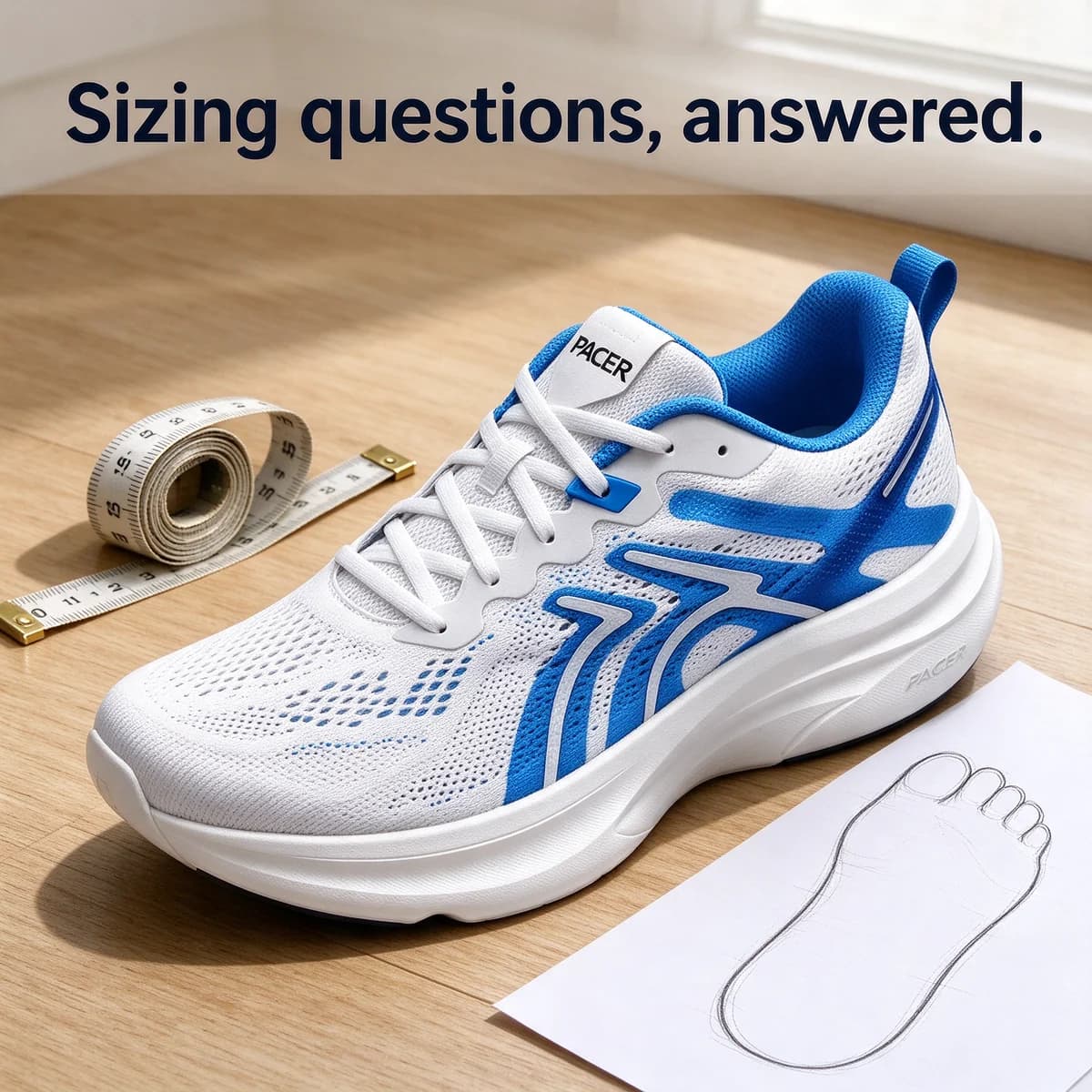
A white and electric-blue Pacer running shoe on a wooden floor beside a cloth measuring tape and a sheet of paper with a traced foot outline, headline "Sizing questions, answered."

PacerObjections, card by cardCarousel · card 1 of 5 · 1:1

“Sizing questions, answered.”

Fit is the usual worry with shoes bought online, so this carousel takes it on directly: how to measure, how the size runs, wide feet, then free returns on the last card. The tape measure on card one signals a practical answer rather than a pitch.

Gold Mira hoops and a thin chain laid on the collar of a folded cream linen shirt on a bed in soft window light, headline "5 ways to wear one chain."

MiraStyling lookbookCarousel · card 1 of 6 · 1:1

“5 ways to wear one chain.”

Many uses for one piece answers a common doubt about jewellery: will I actually wear it? Each card styles the chain for a different occasion (with a shirt, layered, with the hoops, for a wedding, for work), which also makes the carousel worth saving.

Two more ways to try

  • HHilltop RoastersSponsored

    Swipe for 4 ways to brew it

    1. 1Pour-over
    2. 2French press
    3. 3Moka pot
    4. 4Cold brew
    HILLTOP ROASTERS
    Single-origin coffeeShop the beans

    Listicle ad

    A cover card that lists what's on the following cards works like a contents page. People who only care about one brewing method know it's coming and swipe straight to it.

    Edit this template
  • DDewySponsored

    What's in the bottle

    DEWYSERUM
    15% vitamin CAmber glassGlass dropper
    Vitamin C SerumShop the serum

    Feature callout ad

    Middle cards can be denser than card one, because anyone who has swiped this far is already interested. Callouts suit that stretch of a carousel, where detail answers questions instead of getting in the way.

    Edit this template

Angles to test first

  1. 1

    The range

    One product per card, all shot the same way, so people compare colours, prints or flavours side by side. Card one says how many there are.

  2. 2

    Steps in order

    A recipe, a routine or a set-up with one step per card and the product in every frame. Number the cards so people know how long it runs.

  3. 3

    A story that unfolds

    A scene on card one, the problem on card two, then the product and the payoff. Curiosity about what happens next keeps people swiping.

  4. 4

    One reason per card

    Split the case for buying into single points, each with its own picture. It reads faster than a block of benefits in the primary text.

  5. 5

    Build your set

    Give each item in a bundle its own card and link, then close on the bundle. It turns a discount into a choice people enjoy making.

  6. 6

    Objections, answered

    Size, fit, care, delivery and returns: one honest answer per card for the questions that stop people from ordering.

15 hooks for carousel ads

  • [Number] [prints], one easy [cut].
  • [Proper chai] in [number] steps.
  • [Number] reasons [dogs] [sit] for these.
  • Swipe along the [shelf].
  • [Place], [time]. Swipe to see what happens.
  • Pick any [number] [scents].
  • [Sizing] questions, answered.
  • [Number] ways to wear one [chain].
  • Which [roast] are you? Swipe to find out.
  • Everything in the [box], one card each.
  • Our [number] bestsellers, in one swipe.
  • Before you buy [product], swipe.
  • From [bare shelf] to [jungle] in [3] cards.
  • The [morning] routine in [4] cards.
  • Start here: [product] explained in [number] cards.

Moments to plan for

  • New collection drop

    A range carousel with one new piece per card and the full line-up on the last card, so returning customers see everything in one ad.

  • Festive gifting (Oct–Dec)

    A gift-guide carousel with one card per person or per budget, each linked straight to the product it shows.

  • Wedding season (Nov–Feb in India)

    Styling lookbooks for clothing and jewellery, one function per card: haldi, mehendi, sangeet and the reception.

  • Back in stock

    When several colours or sizes return at once, give each its own card so people can jump to the one they missed.

  • End of season sale

    One reduced product per card with its sale price on the card, and a 'shop the sale' card to finish.

  • First-order offers

    A reasons carousel for people who have visited but not bought: four short reasons, then the welcome offer on the final card.

Watch out for

  • If your cards tell a story or follow steps, turn off automatic card ordering. As of October 2026, Meta's carousel format page says it can reorder cards by performance and advises opting out when the carousel tells a sequential story.
  • Make card one work on its own. Assume some people never swipe, so the first card still needs the product, the brand and a reason to care.
  • Keep one visual system across the cards: the same background, type and product scale. Otherwise the carousel looks like several unrelated ads stapled together.
  • Each card can carry its own link, so check that every card opens the product it shows, not your home page.
  • In a panorama, put the seams between cards on quiet areas such as a gap, a wall or a shadow, never through the product or a word.

Practical pointers, not legal advice. Check Meta’s Advertising Standards and your local rules.

A carousel is several cards inside one ad. People swipe sideways through them, and each card has its own image or video, headline and link, under one shared primary text. As of October 2026, Meta's carousel ad format page (opens in a new tab) says a carousel can hold up to 10 images or videos, each with its own link. That ceiling is generous. The carousels above use three to six cards, because every extra card is one more thing to make well.

The reason to pick a carousel over a static ad is that the idea has more than one part. A range has several colours. A recipe has steps. A story has a start and an end. A purchase comes with several objections. Squeeze any of those into a single image and you get a cluttered static. Spread them across cards and each part gets room to breathe.

Card one does most of the work

Plenty of people will only ever see the first card, so plan it as if it were the whole ad. It needs three things:

  • The product, recognisable. Someone who never swipes should still know what you sell and who you are.
  • A reason to swipe. A count ("4 steps", "5 ways"), an unfinished scene ("Open-plan office, 11 am.") or the edge of the next card showing.
  • A promise the next cards keep. If card one says four prints, there are four prints. A carousel that baits the swipe and then repeats the same shot wastes the attention it just earned.

The middle cards can be denser, because whoever reaches them is already curious. That's where callouts, close-ups and individual prices belong. The last card should close the loop: the bundle, the full range, the offer or the free returns, with a link that goes somewhere useful.

Five structures that suit carousels

Structure Card one The middle cards The last card
Range How many options there are One option per card All of them together
Steps The promise, with a count One step per card The finished result with the product
Story A scene or a moment The problem, then the product The payoff
Reasons The strongest reason, shown One reason per card The offer
Objections The question, named One answer per card The risk-free part, such as returns

Choose the structure from the product, not the other way round. A kurta label with four prints has a natural range. A chai brand has a natural recipe. Headphones have a natural story, because the product is the end of an everyday annoyance. Jewellery has a natural lookbook, because the doubt is whether one piece will get worn enough. The carousel ad template lays out the card-by-card skeleton if you'd rather start from a frame.

Card order is a creative decision

Meta can rearrange your cards. Its carousel page (checked October 2026) says you can let it optimise the order of cards based on each card's performance, and that you should opt out of that automatic optimisation if the format is telling a sequential story. For a range carousel, letting Meta lead with the card people tap most can be useful. For steps, stories and panoramas it breaks the ad, so switch it off and check the preview before launch.

Order matters inside your own plan too. Lead with the option most people want, not the newest one. Put the card that answers the biggest doubt second, while attention is still high. Save the bundle or the offer for the end, where it rewards the people who swiped all the way.

BulkAds makes single image and video ads, and its launcher publishes each one as its own ad, so it doesn't build the carousel itself. What it can take off your hands is the slow part: a set of cards that look like they belong together. Ask the AI ad generator for a batch of square images from one packshot, with your own instructions spelling out the structure ("four cards, the steps for making chai, the tin in every frame, same stove and light"). Every image in the batch starts from the same product photo, brand colours and fonts, so the set comes out far more consistent than images made one at a time. Expect the odd card to drift in background or light, and regenerate just that one before you build.

You then download the cards and assemble the carousel in Meta Ads Manager, setting each card's headline and link there. Launched through BulkAds as single image ads, the same cards also work as a quick test: if card three outsells the others on its own, it's probably your lead card. If you'd rather hand Meta a set of assets and let it decide which one, and in which format, each person sees, the flexible ads entry explains how that works.

Take Saar, a fictional block-print label with one easy kurta cut in four prints. A range carousel could run like this:

  1. Card one: the white-and-indigo bestseller on a hanger, "Four prints, one easy cut.", with the edges of the other three peeking in.
  2. Card two: the rust print at $20, on the same hanger and wall, linked to that print.
  3. Card three: the sage print, also $20.
  4. Card four: the charcoal print, also $20.
  5. Card five: two kurtas folded together, "Pick any two", at $36 instead of $39.

That's five images made in one batch, all on the same hanger against the same wall. The price sits on each card because people comparing prints want to know straight away whether they cost the same, and the last card gives a reason to buy two. To learn whether choice helps or hurts, run the carousel next to card one on its own as a static. If the static wins, the range isn't pulling its weight. If the carousel wins, browsing is part of the appeal. The guide to carousel ad design goes further into layouts, type and card order.

Questions people ask

How many cards should a carousel ad have?

As many as the idea needs and no more. As of October 2026, Meta's carousel ad format page allows up to 10 images or videos in one carousel, but three to six is usually enough for a range, a short recipe or a set of reasons. Every card has to be worth the swipe.

Should I let Meta reorder my carousel cards?

Only when each card stands on its own, as in a product range. If the cards tell a story, show steps or form a panorama, turn automatic ordering off. Meta's carousel page advises opting out for sequential stories.

What should the first card of a carousel show?

The product, clearly, plus a reason to swipe: a count, an unfinished scene or the edge of the next card. Assume some people will only ever see card one, so it has to work alone.

Can BulkAds make carousel ads?

BulkAds makes the cards: a batch of matching images built from your product photo and brand kit, in the order and style you describe. It launches single image and video ads, so you assemble the carousel itself in Meta Ads Manager.

Are Saar, Kettle & Co. and the other brands real?

No. They're fictional brands, and every card on this page was made with AI to illustrate the structure.

Keep going

Every brand on this page is fictional and every ad was made with AI for illustration — they’re examples, not case studies.

BulkAds AI is an independent product and is not affiliated with, endorsed or sponsored by Meta Platforms, Inc. Facebook and Instagram are trademarks of Meta Platforms, Inc.

More ad examples

Your next fifty ads are one link away.

Paste your website, meet your brand kit and see your first batch in minutes. 7 days for $9.99 — cancel anytime.

yourbrand.comMake my ads

See pricingExplore featuresBrowse the library