What a Story ad has to do
A Story ad turns up between the stories of accounts someone follows, full screen, with a progress bar along the top and a thumb ready to tap on to the next one. There is no caption above it to set the scene and no feed around it to slow the scroll. The image, or the first second of the video, does all the work.
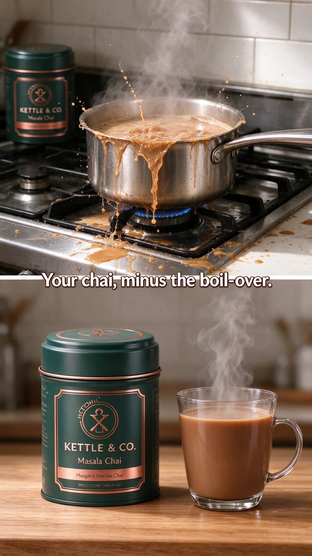
That changes what good looks like. A feed ad can afford a detailed product shot and let the primary text explain it. A Story ad has to make its point with one picture and a few words, inside a frame that is usually much taller than the product. The eight examples above are built around that: they use the height, they look like stories rather than posters, and each one carries exactly one idea.
Composing for the tall frame
It helps to think of a 9:16 frame as three bands.
- The top band sits under the progress bar and the account name. Give it to the background: sky, wall, steam, a shelf edge.
- The middle is where the eye goes first. Put the headline in its upper half and the product in the centre.
- The bottom band is where the call-to-action button and the reply bar sit. Let the scene run through it, with nothing anyone needs to read.
The safe zone checker draws those bands over your own image, so run every tall ad through it before it goes anywhere. The safe zone glossary entry explains why the margins are only approximate and why a design shared with Reels needs a deeper bottom margin than a Story alone.
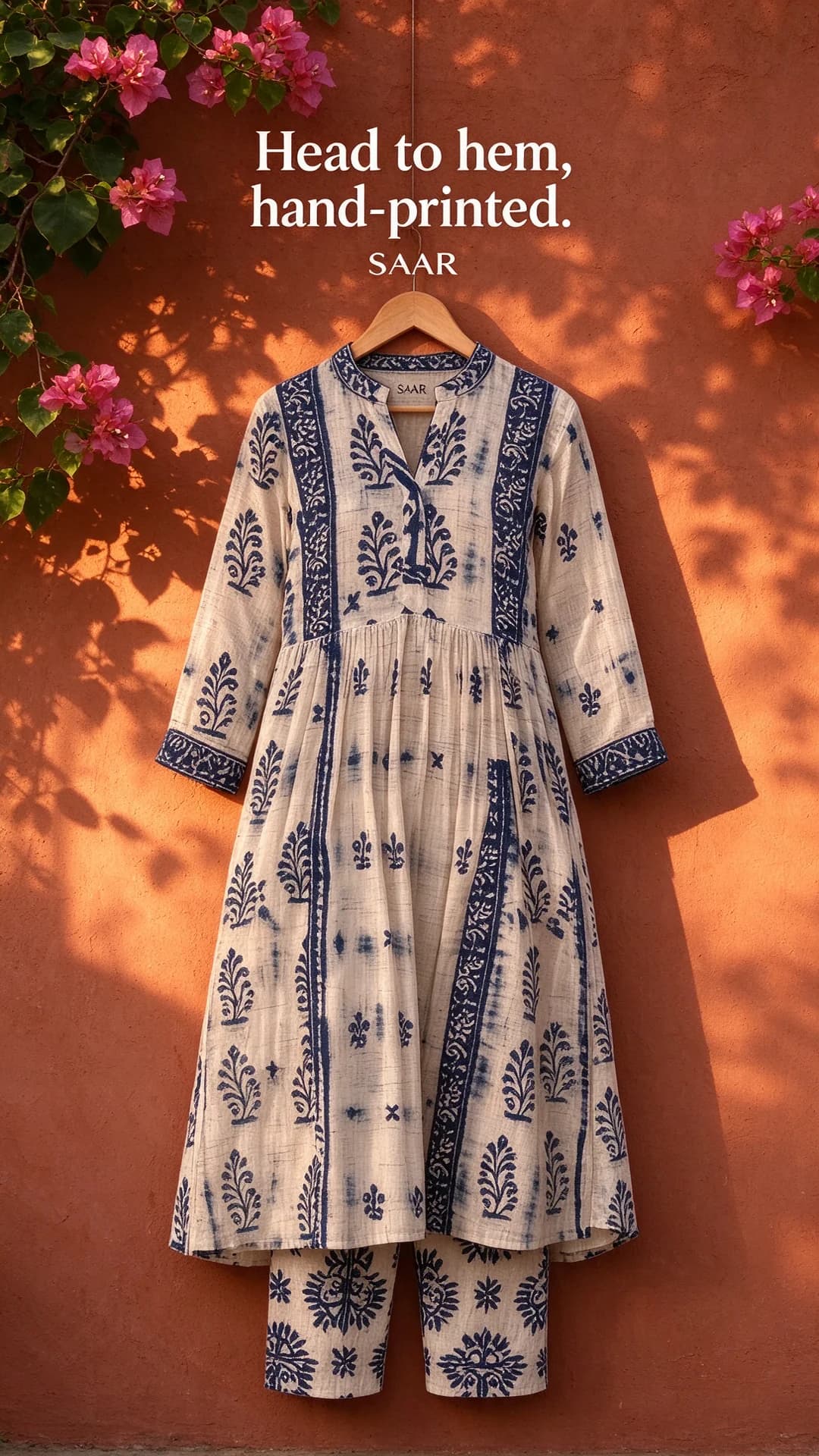
The second rule is to recompose rather than resize. The Saar kurta works because the garment was set up for the tall frame, hanger to hem. Put the same kurta on a square and extend the canvas, and you get a small product floating in a band of colour, which tells the viewer at once that the ad was made for another placement.
Looking like a story, not a poster
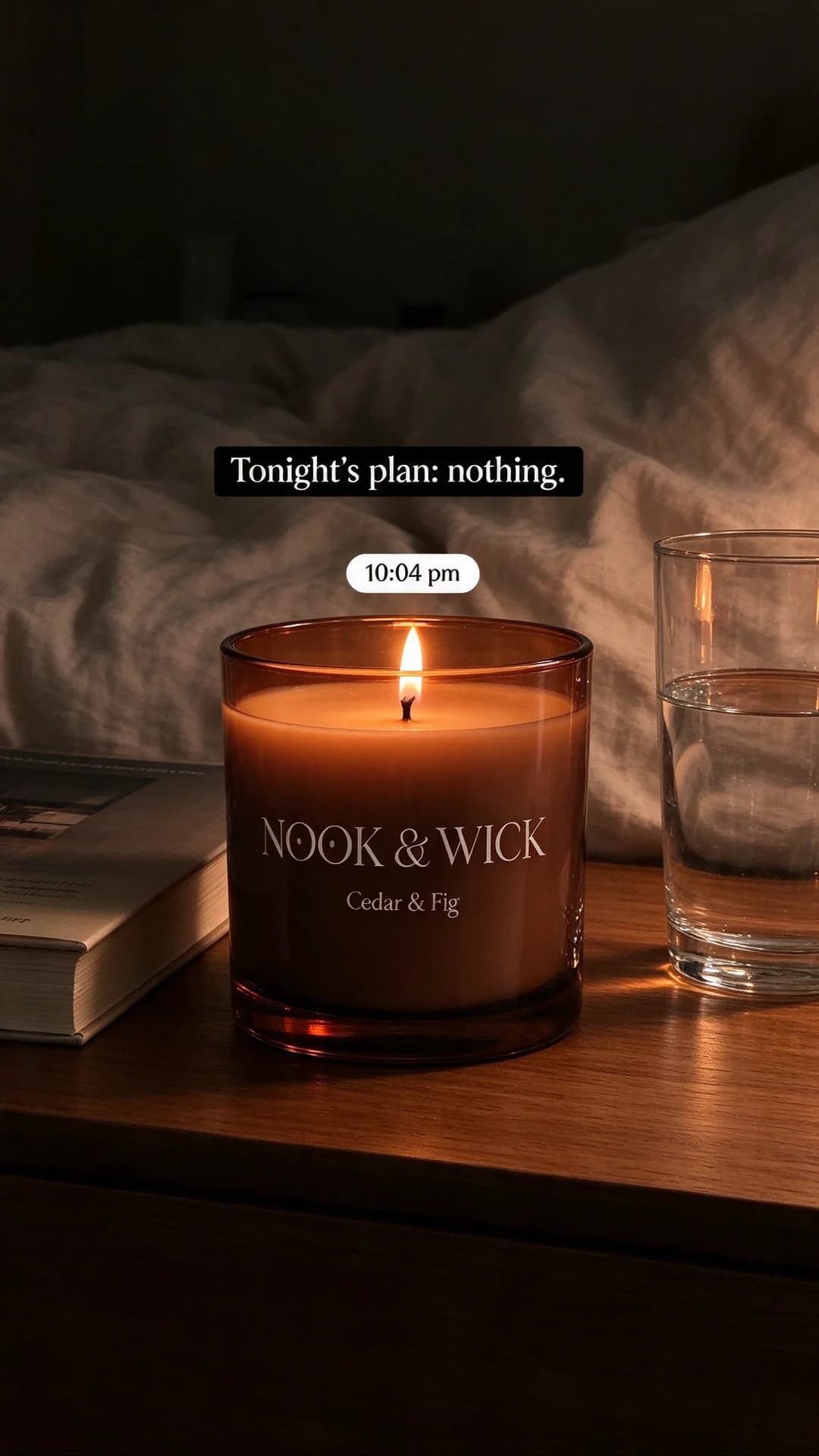
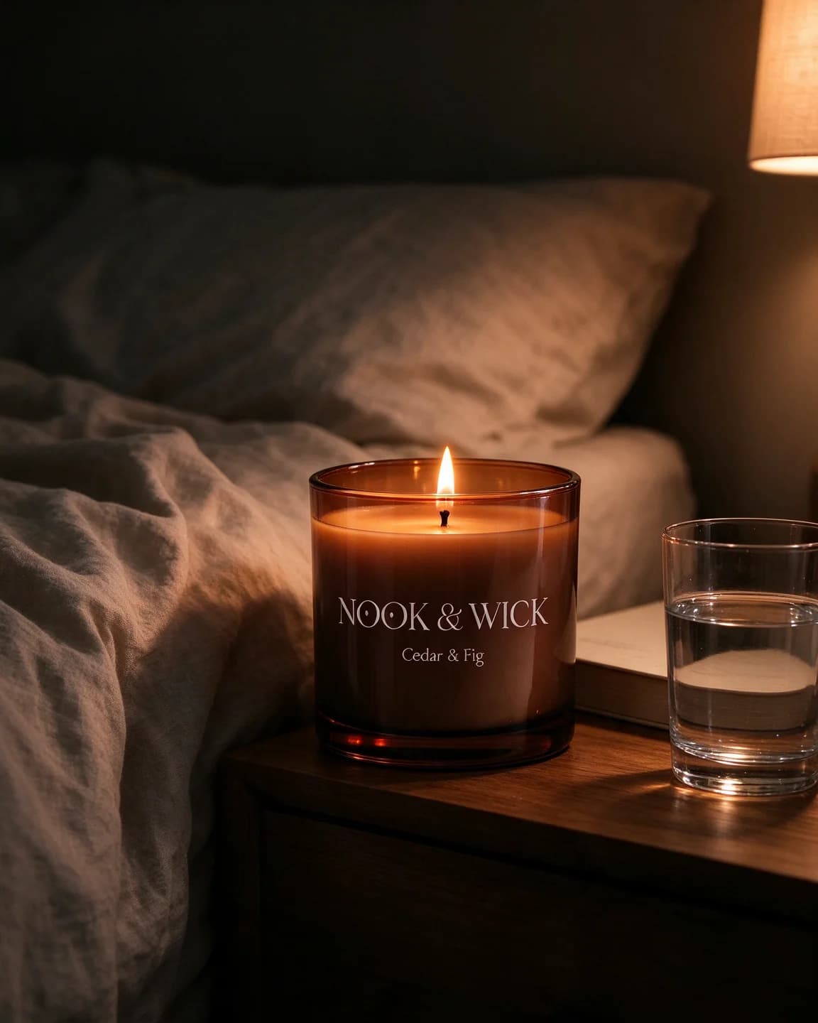
Many of the stories around your ad were shot on phones, with plain text boxes, time stickers and imperfect light. An ad that borrows some of that grammar earns a beat of attention before the brain files it under 'ad'. The Nook & Wick candle is the clearest example in the swipe file: a bedside table at night, a caption in a highlighted box, a small time sticker.
Native doesn't mean careless. The label still faces the camera, the product is still sharp, and the brand colour still shows somewhere in the frame. What you drop is the studio polish: the seamless backdrop, the perfect symmetry, the three lines of copy. The entries on lo-fi creative and native ad style go further into this look.
One card, a sequence or motion
A Story ad can be a single image, a short video, or a few cards that people tap through. Each suits a different job.
| Build | Best for | In the swipe file |
|---|---|---|
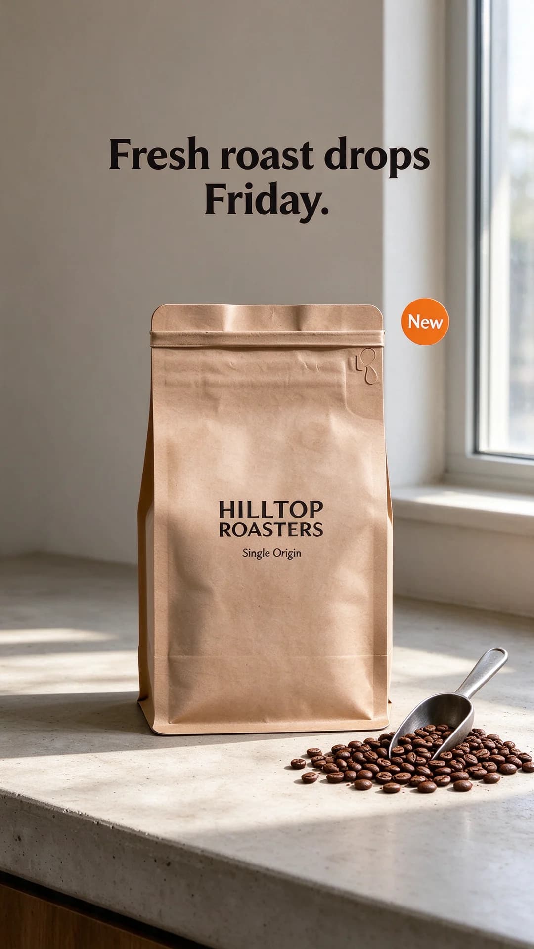
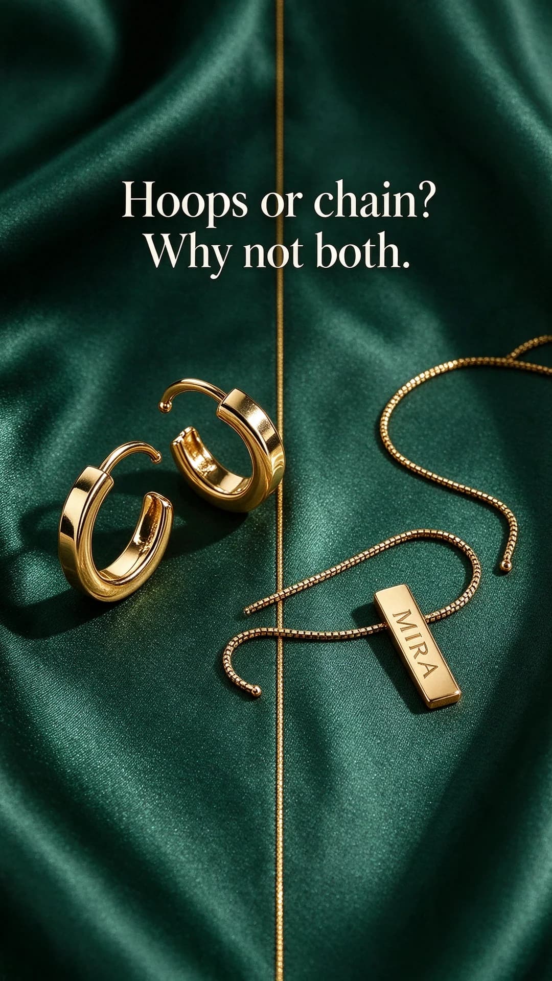
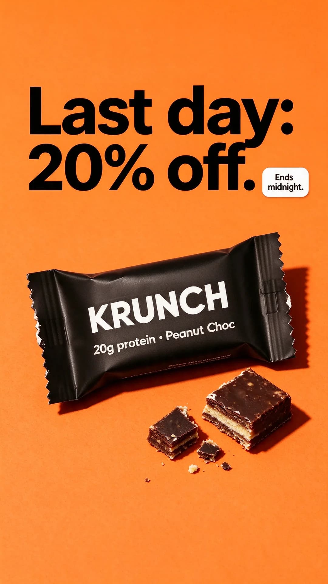
| One image | One clear message, such as a drop date, a deadline or a question | Hilltop Roasters, Krunch, Mira |
| Short video | Products that change when they move: a flame, steam, fabric | Nook & Wick (first frame shown) |
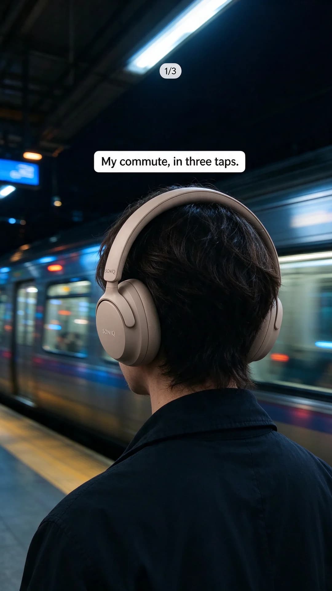
| A short sequence of cards | A tiny story told as hook, proof, offer | Soniq (card one of three) |
Start with single images. They are the quickest to make and to compare, and they tell you which message works before you invest in motion. When one wins, rebuild it as a short video or as the opener of a sequence. The first frame guide covers how to open a vertical video, and the Reels ad examples show the same tall frame used with sound and longer motion.
A worked example: one candle, one week of Stories
Say Nook & Wick sells its Cedar & Fig candle at $9.25 and wants a week of Story ads for a new scent. A plan built from the angles on this page could look like this:
- Two native snaps, one by the bed and one on the edge of a bath, both captioned in a plain highlighted box.
- One full-frame mood shot: the candle on a windowsill at dusk, with only the scent name on screen.
- A drop pair: "New scent drops Friday" the day before, "Out now" on the day.
- Two deadline cards for the last day of the launch offer, one reading "15% off" and one reading "$1.40 off". The scene and the product stay the same, so the only difference is how the saving is written.
- A three-card sequence: match strikes, flame catches, offer card.
That is eight Story ads built from ten images and one product photo. Six of them test a different reason to stop, and the deadline pair tests one way of writing the offer against another. The guide on how many ad creatives to test covers how many versions a test needs to say anything.
How BulkAds makes Story ads
In BulkAds you pick 9:16 when you set up a batch, and every ad in it is composed for the tall frame from the start rather than cropped from a feed version. A batch holds up to 12 ads, each with its own angle, and it starts from your real product photo, so the candle, bag or kurta in the Story is the one you actually ship. See product photo ads for how the packshot is kept intact.
Before a batch reaches you, a pre-flight check reads the on-image text for spelling and gibberish, compares the product with your original photo and flags policy risks such as fake buttons. If only the headline comes out wrong, you can regenerate that one element instead of paying for a whole new ad.
To add motion, turn a Story image into a short video ad. The scene moves gently, a flame flickers or steam rises, while the text and the product stay steady and readable. A video uses 20 credits against 2 for an image, which is why the usual rhythm is to test images first and animate the ones that sell.
When the batch is ready, the bulk ad launcher sends it to your own Meta ad account with the placements you choose, each creative as its own ad and everything paused until you approve. Their results sync back into BulkAds. If you'd rather hand the test over, Autopilot launches the Story ads as its own test, stops the ones that spend without selling and drafts fresh versions of the ones that do, inside your caps.
One limit to know: the launcher publishes single image and video ads, so it doesn't stitch cards into a tap-through sequence. For a sequence like the Soniq commute, make the three cards in one batch, download them and assemble them as a carousel in Meta Ads Manager. Because every card in the batch reads the same brand kit and product photo, the three already look like one story.
When a Story ad wins
Keep the idea and change one thing at a time:
- Same message, new scene: the candle moves from the bedside table to a bookshelf.
- Same scene, new caption style: a highlighted text box tried against a bold poster headline.
- Same ad, more cards: the winning image becomes card one of a short sequence, with the next two cards answering what it promised.
- Same idea, feed version: rebuild it in 4:5 for the feed rather than running the tall version everywhere. The static ad examples show what changes when the frame gets shorter.
Questions people ask
What makes a good Story ad?
One idea, composed for the tall frame, that looks at home among the stories around it. Put the headline in the upper middle and the product in the centre, and leave the top and bottom strips to the background.
Can I use my feed ad as a Story ad?
It will run, but a square or 4:5 design dropped into a 9:16 frame leaves empty bands and small text. Recompose it instead: the same idea, the product larger, the headline moved into the middle of the frame.
Should Story ads be images or video?
Both have a place. Images are quicker to make and compare, so use them to find the message that sells. Then turn the winners into short videos, which suit products that change when they move, such as steam, flame or fabric.
How much text should a Story ad have?
As little as possible: a headline of two to seven words and, at most, one small sticker such as a date or an offer. Longer explanations belong on a later card or on the landing page.
Can BulkAds make Story ads?
Yes. Choose 9:16 when you set up a batch, and each ad is composed for the tall frame from your real product photo. A still can then be turned into a short video with gentle motion. BulkAds launches single image and video ads, so a tap-through sequence of cards is put together as a carousel in Meta Ads Manager.
Are these real brands?
No. Nook & Wick, Saar, Hilltop Roasters and the others are fictional, and every ad on this page was made with AI to show the idea.
Keep going
- Features
AI video ads
Turn a winning still into a Reel
- Free tools
Reels & Stories safe zone checker
See what Reels, Stories and feed crops may cover on your ad
- Guides
The first frame of a video ad: what to show, and how to test it
The opening frame is all many viewers see. What to put in it, five openings that suit product ads, the ones that waste a second, a checklist and a cheap way to test them.
- Ad templates
Story ad template
One line, one product, one sticker, composed for the tall frame
- Ad templates
Countdown ad template
A real deadline in giant type, with one version for each day left
- Ad templates
Split-screen ad template
Two panes in one frame, and the difference visible before anyone reads
Every brand on this page is fictional and every ad was made with AI for illustration — they’re examples, not case studies.
BulkAds AI is an independent product and is not affiliated with, endorsed or sponsored by Meta Platforms, Inc. Facebook and Instagram are trademarks of Meta Platforms, Inc.