The short version
- One sharp packshot on a plain background is enough to make a full test of around 20 genuinely different ads.
- Change the idea, not just the colours: each ad takes its own angle, from lifestyle and bold claim to offer, UGC-style and curiosity.
- Brief every ad in a few lines: angle, scene, headline, proof point, size and what must not change.
- Launch the batch as one test in one ad set and judge it on purchases, not likes.
- Turn each winner into new executions and new formats before it wears out.
Start with one good packshot
Most product photo ad ideas need only one thing most brands already have: a packshot. That's a plain photo of the product on its own, usually on a white or neutral background. It's the least exciting photo you own and the most useful one — every scene, layout and headline in this guide is built around it.
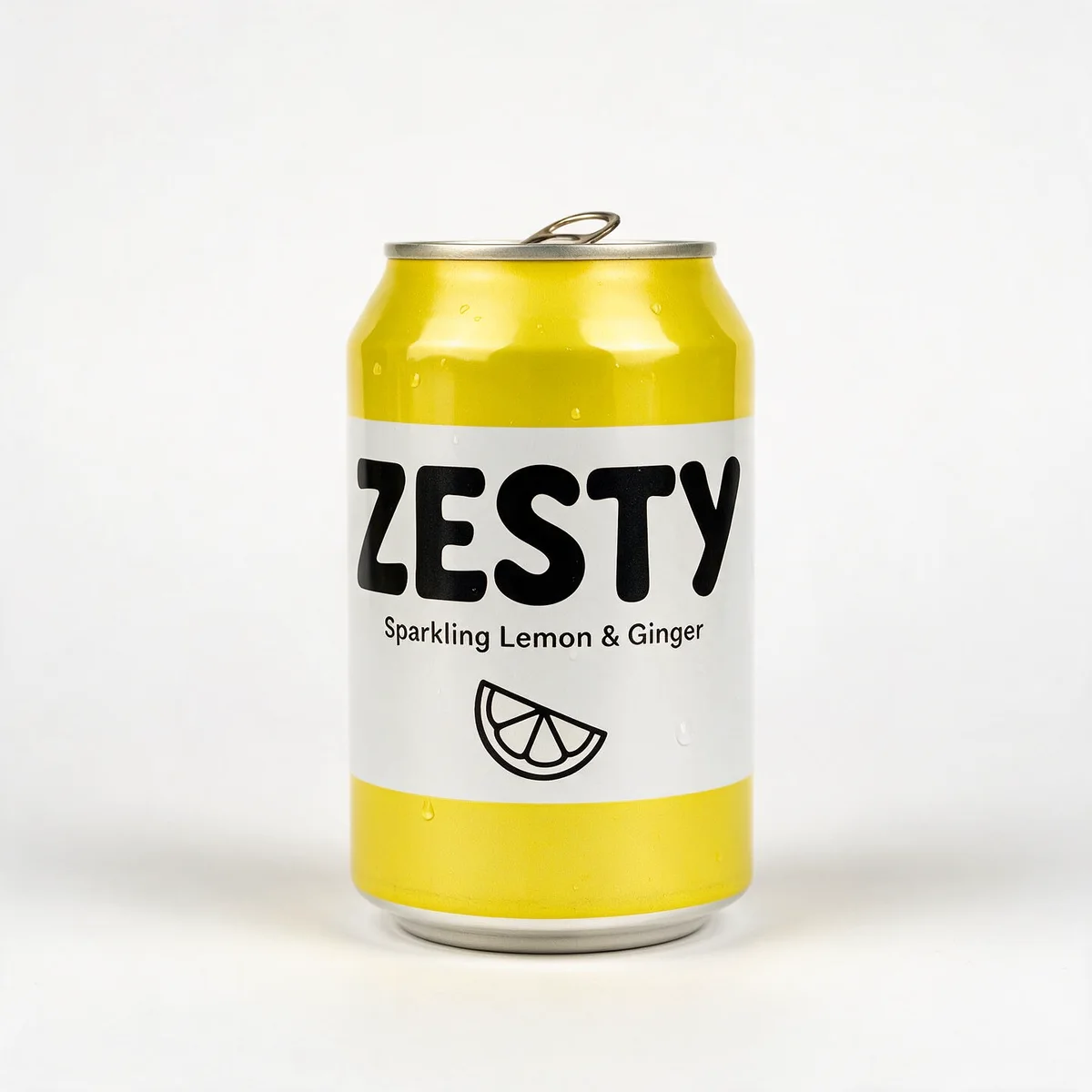
One photo is enough because, from one ad to the next, the product isn't what changes people's reaction. The scene, the headline, the offer and the reason to care are — and all of those can vary while the product stays exactly the same. That also keeps the test fair: when every ad shows the identical can, a difference in results comes from the idea, not from a better photo.
The packshot does need to be good: whole product in frame, label sharp, soft even light, plain background, at least 1000 pixels on the short side. If yours isn't there yet, start with our guide to shooting product photos for ads. Every ad you make inherits the photo's flaws.
11 product photo ad ideas from one packshot
Each idea below is a different angle: a different reason for someone to stop scrolling and care. The headlines are the ones we used for Zesty, a sugar-free lemon and ginger soda.
1. Lifestyle
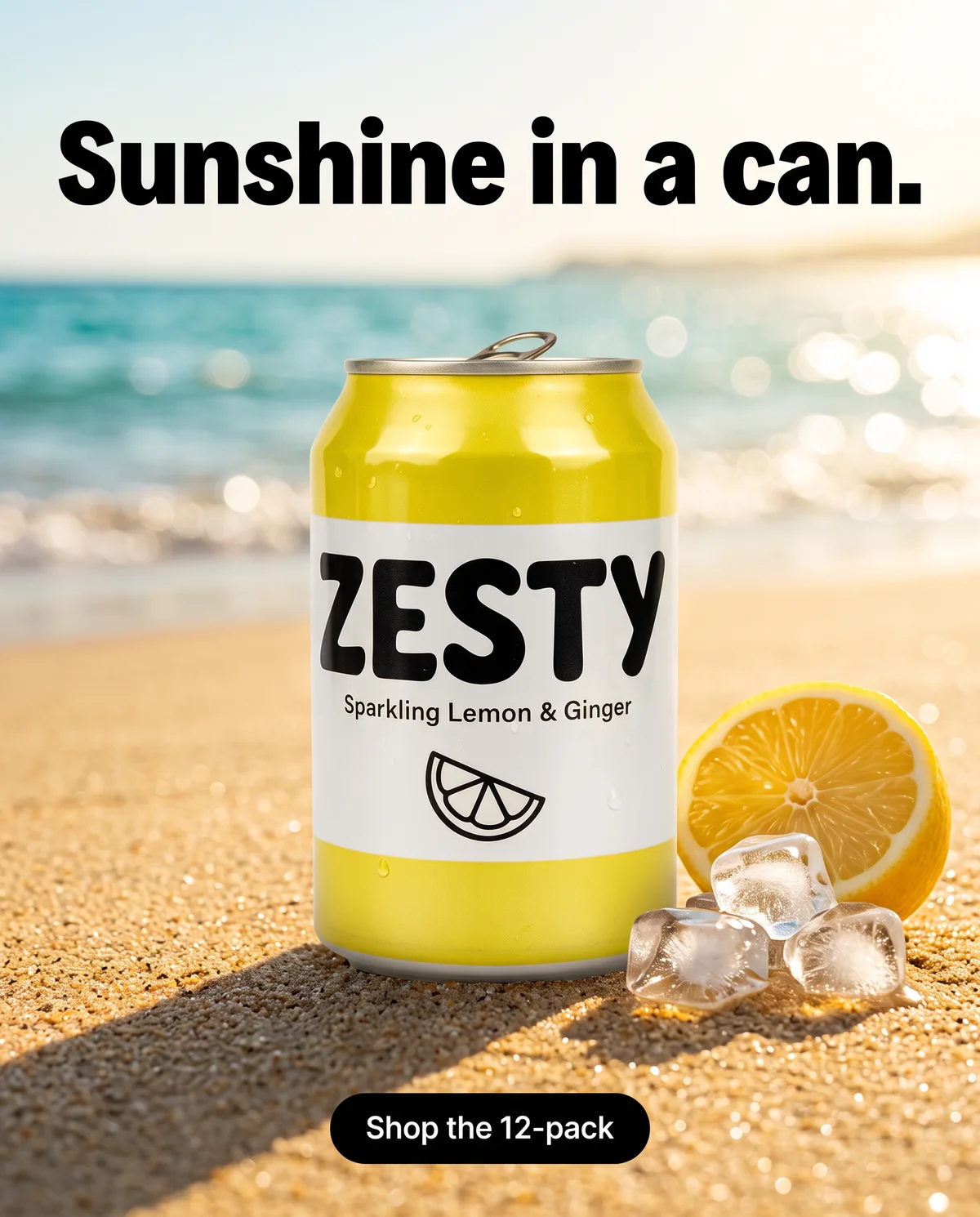
The product in a setting that carries your brand's mood — a beach, a balcony, a sunny kitchen. It sells a feeling before a feature. Brief it: the place, the time of day, the light and one or two props. "Sunshine in a can."
2. Moment of use
The exact moment the product earns its place in someone's day: the 3pm slump at a desk, the first sip after work. Tie the product to a moment people already have and the moment itself becomes the reminder. Brief it: the moment, the setting and the small problem it solves. "Your 3pm slump, fixed."
3. Ingredients or flat lay
Shot from above, with the product surrounded by what's inside it — lemon slices, ginger root, ice. It suits simple products and customers who read labels. Brief it: real ingredients only, the background colour and the layout. "Just lemon, ginger & bubbles."
4. Bold claim
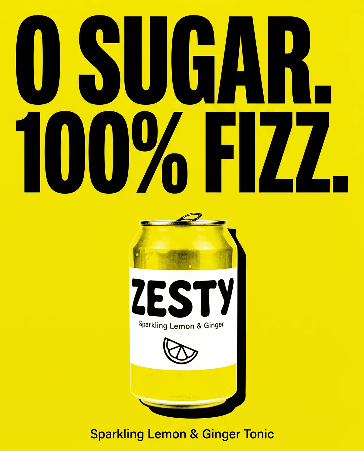
One proof point, set huge on a flat brand colour, with the product in the middle. Use it when a single fact does the selling, and only with a claim you can prove. Brief it: the exact claim, the colour and where the product sits. "0 sugar. 100% fizz." See the bold claim template.
5. Offer
The deal is the headline: a bundle, free delivery above a threshold, a first-order discount. It's strongest with people who already know you and need a reason to buy now. Brief it: the offer, its conditions and its end date, all matching your site. "Stock up. Free delivery." See the offer template.
6. UGC-style
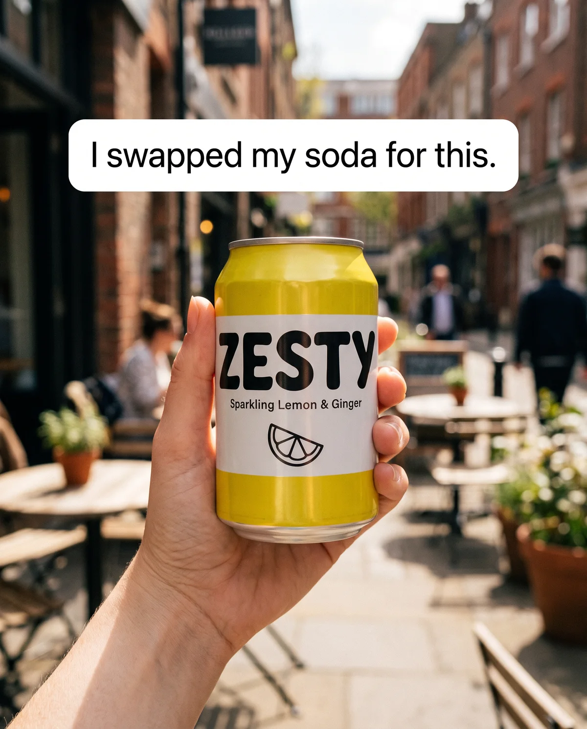
A hand-held, phone-camera look with a first-person caption, as if a customer had posted it. Among polished brand ads it reads like a recommendation. Brief it: whose hand, where, and a caption in everyday words. "I swapped my soda for this." See the UGC template.
7. Occasion
The same product in another part of life: the gym bag, movie night, a road trip, the office fridge. Each occasion reaches people who never thought of you for that moment. Brief it: the occasion and the one detail that makes it recognisable. "Post-workout, but fizzy."
8. Social
The product in a group moment — a party ice bucket, a table of friends, a match night. It says "this is for sharing", which suits multi-packs. Brief it: the gathering, and whether people appear or are only hinted at through hands and glasses. "Bring the good bubbles."
9. Seasonal
Summer, monsoon, Diwali, exam season: the same product dressed for the time of year. Seasonal ads are short-lived, and they give you a natural reason to refresh. Brief it: the season's colours and props, kept on-brand. "Summer's in the fridge."
10. Curiosity
A question the ad only half answers, so people read on or tap through. It works when the answer is genuinely interesting: an ingredient, a process, the reason you started. Brief it: the question, and the answer your primary text gives. "Why is there real ginger in this?"
11. Launch
News: a new flavour, a new size, back in stock. People notice "new" for a few weeks, so launch ads are short-lived by design. Brief it: what's new, from when, and a clear "New" label. "New: the 24-can pack."
From 11 angles to 20 ads
Eleven angles give you eleven ads. To reach twenty, give most angles a second execution — a different scene and a different headline on the same idea. Two reasons:
- One execution isn't a fair trial of an angle. A good idea can lose because of a dull image. Two different takes tell you whether the angle or the picture was the problem.
- Near-copies teach you little. Practitioners report that Meta's delivery tends to treat very similar ads as largely the same, so a new background colour on the same layout adds almost nothing. Make the second execution clearly different.
Here's the 20-ad plan we'd use for Zesty:
| Angle | Ads | Example headlines |
|---|---|---|
| Lifestyle | 2 | Sunshine in a can. · Sunday, but fizzier. |
| Moment of use | 2 | Your 3pm slump, fixed. · The first sip after work. |
| Ingredients / flat lay | 2 | Just lemon, ginger & bubbles. · Real ginger juice. 0 g sugar. |
| Bold claim | 2 | 0 sugar. 100% fizz. · Vegan. Zero sugar. All fizz. |
| Offer | 2 | Stock up. Free delivery. · Party pack, 20% off. |
| UGC-style | 2 | I swapped my soda for this. · My commute drink now. |
| Occasion | 2 | Post-workout, but fizzy. · Movie night, minus the sugar. |
| Social | 2 | Bring the good bubbles. · Match night, sorted. |
| Curiosity | 2 | Why is there real ginger in this? · Guess what's not in this can. |
| Seasonal | 1 | Summer's in the fridge. |
| Launch | 1 | New: the 24-can pack. |
Seasonal and launch get one slot each because they only make sense when there's a season or some news. If there isn't, give those slots to the angles you believe in most.
Before you brief anything, check the maths. Twenty creatives, two sizes and a couple of copy versions each multiply quickly, often past what a budget can test in a week. The free ad variation calculator multiplies hooks, visuals, copy and sizes and shows the budget a test that size needs.
Write a brief for every ad
A brief tells whoever makes the ad — a designer, an AI tool or you next Tuesday — exactly what this one ad is for. Good briefs are what stop 20 ads turning into 20 versions of the same ad. A few lines is enough:
Angle:     Moment of use
Scene:     Work desk by a window, mid-afternoon light, laptop, sticky notes
Product:   Can upright, label to camera, lower half of frame, not cropped
Headline:  Your 3pm slump, fixed.
Sub-line:  0 g sugar · real ginger
Size:      4:5 for feeds, plus 9:16 with text clear of the top and bottom
CTA:       Shop now
Keep:      Can shape, label text and colours exactly as in the packshot
The rules that make briefs work:
- One angle per ad. If you can't name the angle in two or three words, the ad is trying to do two jobs.
- About six words on the image. A rule of thumb, not a law: the headline has to land in the second it takes to scroll past. Longer thoughts go in the primary text.
- Proof points from your pack or site only. "0 g sugar" is a fact you can point to on the nutrition label. "Boosts immunity" isn't — and it's a health claim that Meta and regulators both care about.
- Say what must not change. Shape, label and colours are fixed, everything else is open.
- Describe the scene like a photographer. "Beach" gets you a stock photo. "Wet sand at golden hour, can in the lower third, half a lemon and ice beside it" gets you an ad.
Sizes: make every idea for feeds and full screen
Meta shows ads in two main shapes, and your strongest ideas should exist in both:
| Size | Pixels | Where it shows |
|---|---|---|
| 4:5 | 1080 × 1350 | Facebook and Instagram feeds — the most space a feed gives an image |
| 9:16 | 1080 × 1920 | Stories and Reels, full screen |
| 1:1 | 1080 × 1080 | Feeds, and a fallback for most other placements |
Don't just stretch or crop a 4:5 ad into 9:16, recompose it. Full-screen placements cover parts of the image with the profile name at the top and captions and buttons at the bottom. As a rough guide, keep text and logos out of the top and bottom 14% or so in Stories, and out of the top 14% and bottom 35% or so in Reels, with a little margin at the sides. These zones are approximate and vary by placement. The free safe zone checker shows them over your own image.
You don't need a separate ad for each size. Ads Manager lets one ad use different images for feeds and for Stories and Reels, so both versions of an idea share one set of results. Meta renames this option from time to time, so look for placement or asset customisation when you set up the ad.
Write copy for each ad, not for the batch
The quickest way to waste a good image is to run it with a caption written for a different ad. Each creative needs copy that carries its own angle:
- Primary text: make the point in the first line. Meta's recommended length is roughly 125 characters before the "See more" cut.
- Headline: roughly 27–40 characters, carrying the benefit or the offer rather than your brand name.
- Description: roughly 25–30 characters of back-up, such as delivery or pack size. Not every placement shows it.
| Ad | First line of primary text | Headline |
|---|---|---|
| Moment of use | The 3pm slump is real. Our fix: a cold can of lemon, ginger and bubbles, with 0 g sugar. | Your afternoon, sorted |
| Offer | 24 cans, free delivery, zero sugar. That's the fridge sorted till next month. | Free delivery on 24-packs |
| Curiosity | There's real ginger juice in every can. Here's why we put it there. | Why real ginger? |
Launch all 20 as one test
A pile of ads isn't a test until the ads compete on equal terms. The simplest fair set-up:
- One campaign and one ad set, optimised for purchases or your main conversion.
- One ad per creative, so each gets its own results.
- A broad audience, so Meta can look for buyers everywhere, not just where you guessed.
- A budget that can reach a verdict. A common rule of thumb is to let each ad spend one to two times your target cost per purchase before judging it. Say your target is $5.15: twenty ads need roughly $103–$206, spread over a week rather than a day.
- Clear names and UTM tags, so your store's analytics can tell the ads apart.
Expect uneven spend. Meta doesn't split an ad set's budget equally. It pushes spend towards the ads it predicts will do best. That's useful, but an ad that got almost no spend hasn't lost — it hasn't been tested. If your budget can't carry twenty ads, launch the ten you believe in most, then the other ten a week later.
Judge on purchases and cost per purchase, not likes or clicks. A bold claim can win on click-through rate and still lose on sales.
What to do with the winners
When the test settles, look past which ad won to why it won:
- Name the winning angle. If moment of use beat everything, the lesson is the angle, not the desk photo. That's what you build on.
- Make three to five new executions of it. Same idea, new scene and headline: the 3pm desk becomes a late study session, a night shift, a long drive.
- Change the format. Make a 9:16 version for Reels and Stories and a short video of the winning still. Format becomes the new test, with the idea held steady.
- Scale in steps. Raise the budget gradually and watch cost per purchase as you go.
- Keep notes on the losers. An angle that lost once with a weak image may deserve one more execution, one that lost twice can be parked. Write down what you tested so you don't pay for the same lesson twice.
BulkAds' Autopilot handles the mechanical part in the tests it launches itself. It stops ads that spend twice your target cost per purchase without a sale, scales winners in steps inside the caps you set (asking you first, by default) and drafts four fresh variants of each winner, so the next test is ready before the current winner wears out.
Questions people ask
How many ads can you make from one product photo?
As many as you have genuinely different ideas for. Eleven angles, with a second execution of most of them, gives about 20 distinct ads — a solid first test for most product brands.
What kind of product photo works best for ads?
A sharp packshot of the whole product on a plain background, with the label in focus and soft, even light. Glare, cropped caps and busy backgrounds weaken every ad built from it.
Should every ad in a test use a different angle?
For a first test, yes. Different angles show you what makes people buy, while near-identical ads teach you little, and practitioners report that Meta tends to treat very similar ads as largely the same.
Do I need separate ads for feeds and for Stories and Reels?
You need separate images — 4:5 for feeds and 9:16 for Stories and Reels — but Ads Manager usually lets both sit in one ad through placement customisation, so their results stay together.
How much budget does a 20-ad test need?
A common rule of thumb is one to two times your target cost per purchase for each ad, so 20 ads at a $5.15 target need roughly $103–$206. The free ad variation calculator works it out for your numbers.
Is it OK to make UGC-style ads with AI?
A UGC look is fine, a fake customer isn't. Keep captions as general first-person lines, never add an invented name or verified-buyer label, and quote real customers only with their permission.
Keep going
- Features
Product photo ads
Your real packshot, in every scene
- Features
Bulk ad launcher
A whole batch live on Meta in one go
- Free tools
Ad variation calculator
How many ads your hooks, visuals and copy make, and what testing costs
- Guides
Product photography for ads: how to shoot it on a phone
A phone, a window and a sheet of white card are enough. How to shoot product photos that make good ads — and that AI tools can put in new scenes without mangling your label.
- Guides
Meta Andromeda and creative diversity: what changed and what to do
What Meta's Andromeda retrieval system is, what it changes for your ads, a practical diversity checklist and how to tell whether your ads are different enough.
- Ad examples
Beverage ad examples
Drink ads that sell taste, moments and the switch from soda
Written by the BulkAds team. Published , last checked . Meta changes its tools often — if something here no longer matches Ads Manager, tell us at contact@bulkadsai.com.
BulkAds AI is an independent product and is not affiliated with, endorsed or sponsored by Meta Platforms, Inc. Facebook and Instagram are trademarks of Meta Platforms, Inc.