Prompt library

Studio color backdrop prompts that let one color do the selling

A studio color backdrop prompt swaps the white sweep for one deliberate color and keeps everything else simple: one product, one light, one shadow. The color does the job a whole scene would. Below are four prompts we ran on fictional products, from a pet treat pouch on matching teal to a black protein bar on bright yellow paper, with the images they made and a note on each.

4 promptsSeedream 5 Flash edit

The prompts

Each prompt exactly as it was typed, with the image it made. The parts in the highlighter are the ones to swap for your own product.

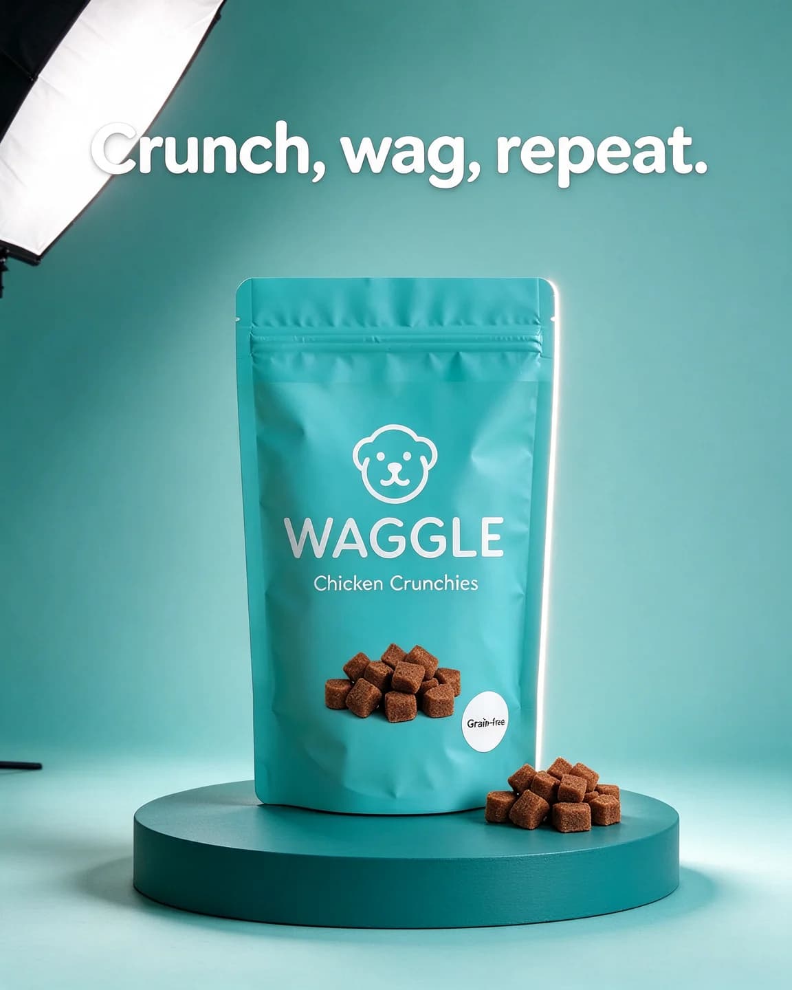
  1. A teal WAGGLE Chicken Crunchies treat pouch on a deeper teal plinth with a small pile of treats, in front of a lighter teal paper backdrop, headline Crunch, wag, repeat.

    Prompt 1

    Seedream 5 Flash edit4:5, product photo as reference

    Keep exactly the same [bright teal stand-up pouch of dog treats with a white dog-face logo, labelled "WAGGLE" and "Chicken Crunchies", with a round white "Grain-free" sticker] from the reference image, identical shape, colours, label text and logo, completely unchanged and clearly the hero of the image. The pouch stands upright on a low round plinth painted a deeper teal, in front of a seamless paper backdrop in a lighter, softer teal that curves from the floor into the wall with no visible horizon line. A small pile of the brown cube-shaped treats sits on the plinth beside the pouch. One large softbox high on the left gives soft, even light and a gentle shadow to the right, and a thin white rim light runs along the right edge of the pouch so it stands clear of the backdrop. Straight-on at plinth height with an 85mm lens, the pouch centered in the lower two thirds of the frame. Rounded white sans-serif headline in the top third: "Crunch, wag, repeat." No other text, no other logos. Portrait 4:5.

    A tonal set only works when the product stands apart from it, so the prompt asks for lighter paper, a deeper plinth and a rim light on one edge. Leave out all three and a teal pouch on teal paper melts into the wall.

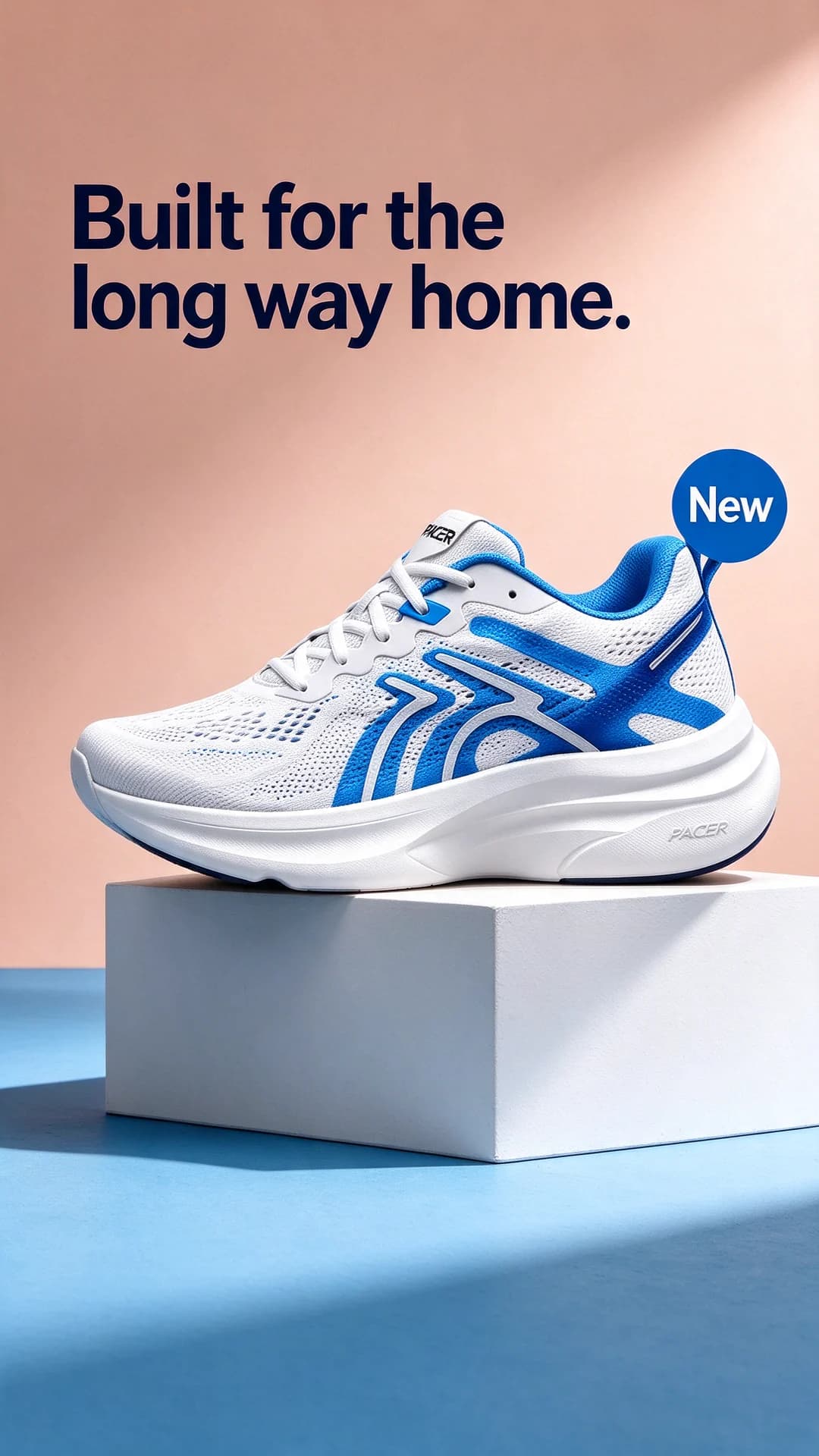
  2. A white and electric-blue PACER running shoe on a white cube against a peach wall and a sky-blue floor with a hard shadow, headline Built for the long way home. and a New sticker

    Prompt 2

    Seedream 5 Flash edit9:16, product photo as reference

    Keep exactly the same [white and electric-blue mesh running shoe with "PACER" on its tongue and on the side of its thick white sole] from the reference image, identical shape, colours, label text and logo, completely unchanged and clearly the hero of the image. A single shoe, in the same side view as the reference, stands on a matte white cube plinth. The set is two flat blocks of color: a soft peach wall in the upper part of the frame and a sky-blue floor below, meeting in a crisp straight line just behind the plinth. One hard spotlight high on the right throws a sharp shadow of the shoe and the cube across the blue floor to the left, and the white parts of the shoe stay pure white. Clean, graphic sportswear look. Camera at plinth height with a 70mm lens, the shoe in the middle third of the frame. Bold dark navy condensed headline in the upper third, on the peach wall: "Built for the long way home." A small electric-blue circle sticker with white text beside the shoe: "New". No other text. Keep the bottom fifth of the frame free of text. Vertical 9:16.

    Two flat blocks give a Story ad a quiet top half for words and a bottom half for the shadow, so nothing crowds the shoe. The line about pure white parts keeps the peach and blue from tinting the white mesh.

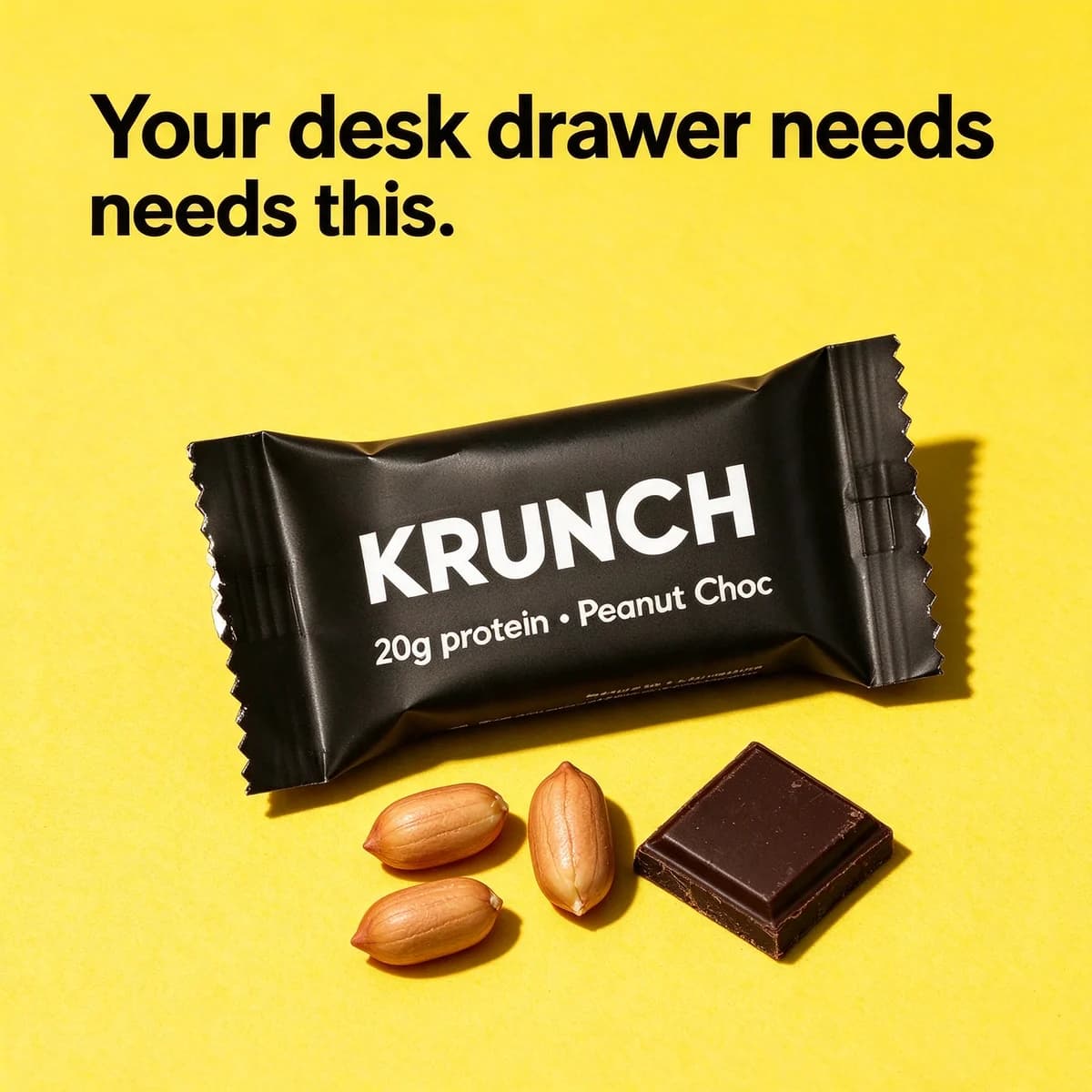
  3. A black KRUNCH protein bar lying diagonally on lemon-yellow paper with peanuts and a square of dark chocolate under hard flash, headline Your desk drawer needs this.

    Prompt 3

    Seedream 5 Flash edit1:1, product photo as reference

    Keep exactly the same [matte black wrapped protein bar with crimped ends, labelled "KRUNCH" and "20g protein · Peanut Choc" in white] from the reference image, identical shape, colours, label text and logo, completely unchanged and clearly the hero of the image. The bar lies at a slight diagonal on a seamless backdrop of saturated lemon-yellow paper, with three whole roasted peanuts and one square of dark chocolate in front of it. Hard direct flash from just above the camera gives a crisp dark shadow below and to the right of the bar and a soft sheen along the crimped ends, and the white letters on the wrapper stay sharp and fully readable. Bold, playful snack-brand look. Shot from above at about 60 degrees with a 50mm lens, the bar across the middle of the frame. Heavy black sans-serif headline at the top: "Your desk drawer needs this." No other text, no other logos. Square 1:1.

    Dark packs vanish on dark or mid-tone paper, so the backdrop is light and loud and a hard flash draws a clean edge around the wrapper. Check the small white words on the wrapper, which are the first thing a flash can blow out.

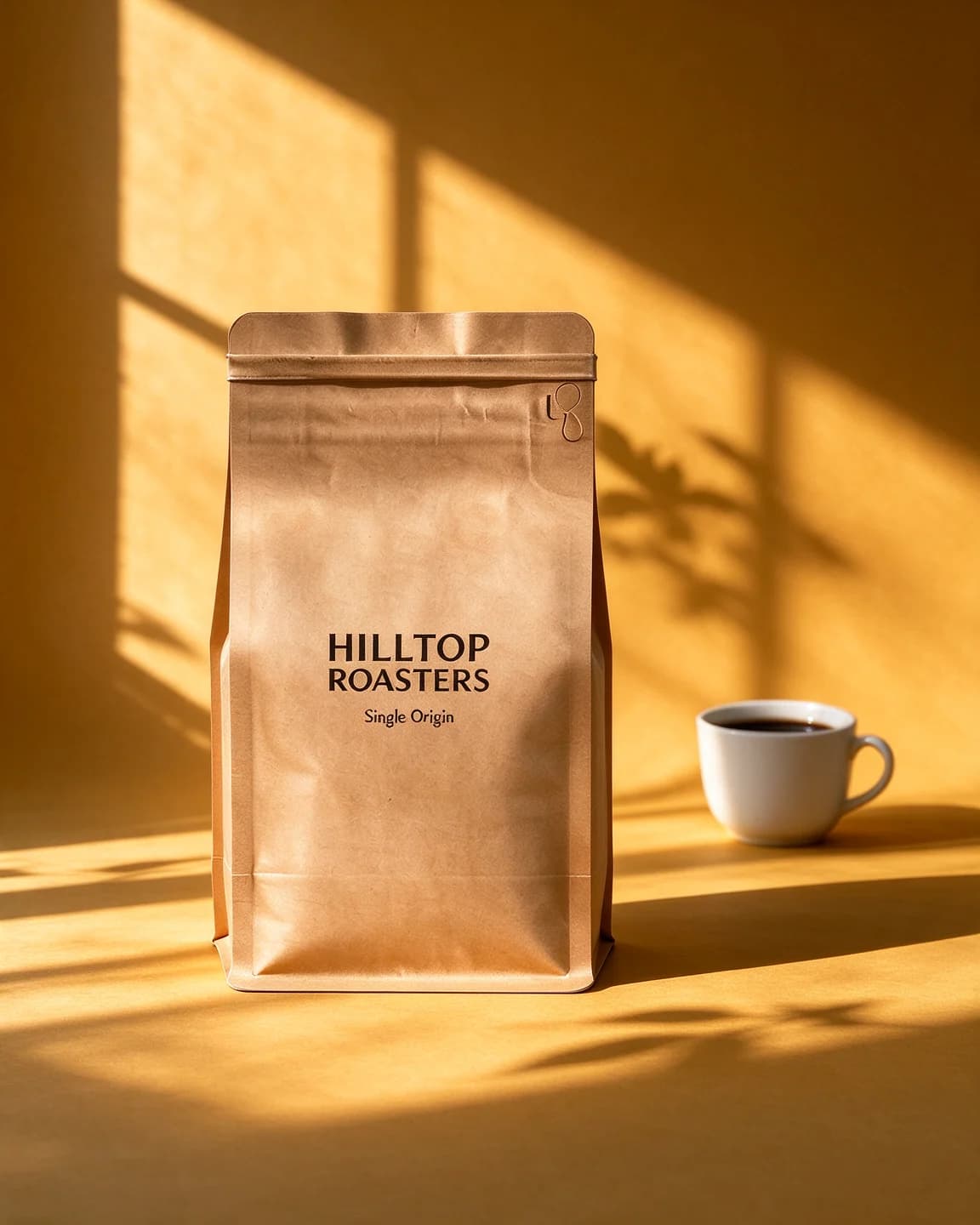
  4. A kraft HILLTOP ROASTERS Single Origin coffee bag on mustard-yellow paper with a window-frame shadow falling across the backdrop and a cup of black coffee behind

    Prompt 4

    Seedream 5 Flash edit4:5, product photo as reference

    Keep exactly the same [matte kraft paper coffee bag with a flat bottom and a small round valve, printed "HILLTOP ROASTERS" and "Single Origin" in black] from the reference image, identical shape, colours, label text and logo, completely unchanged and clearly the hero of the image. The bag stands upright on a seamless sweep of warm mustard-yellow paper. Low, hard morning sunlight from the left passes through an unseen window and casts the shadow of a four-pane window frame and a few leaves diagonally across the backdrop and the floor, falling beside the bag and never across its label, while the bag's own long shadow stretches to the right. A small white ceramic cup of black coffee sits a little behind the bag on the right, slightly out of focus. Warm, quiet, early-morning mood. Eye level with a 70mm lens, the bag slightly left of center so the window shadow fills the right side of the frame. No text anywhere. Portrait 4:5.

    A shaped shadow gives a one-color set a time of day without adding props. Telling the window shadow to stay off the label keeps the brand readable, and the empty right side is room for your own type later.

Make it your product

  1. 1

    Choose three colors to try

    Take your main brand color, the strongest color on your pack and one contrasting color. Make the same prompt in all three and compare them side by side before picking one for a batch.

  2. 2

    Rewrite the part in brackets

    Describe your own product in its place: what it is, its colors, its finish and the exact label words in quotes, for example a frosted glass jar with your brand and product name.

  3. 3

    Test the contrast first

    Drop your packshot onto a square of the chosen color in any image editor. If the outline of the pack is hard to see at thumbnail size, add the rim light line or pick another color.

  4. 4

    Match the type to the paper

    Dark headline on light paper, white or cream on deep colors, in a type style close to your brand font. Say where it sits so it never covers the product.

  5. 5

    Reuse the set across products

    Once a backdrop works, keep its wording and swap only the product. A row of ads with the same set reads as one campaign rather than a pile of one-offs.

Prompt tips

  • Name the backdrop as a real material, such as seamless paper or painted plaster, so the model draws a surface with texture rather than a flat digital fill.
  • Take the color from the product, then move it lighter, deeper or to the opposite side of the color wheel. The exact same shade swallows the pack.
  • Give one light a type, a direction and a shadow, such as a softbox on the left with the shadow falling right. The shadow is what puts the product on the set.
  • Add a rim light on one edge whenever the product and the paper are close in color or tone.
  • Use one plinth, cube or block at most. A color set looks considered because it is nearly empty.
  • Keep a part of the backdrop clear and say that the headline goes there, or say "No text anywhere" to keep it for your own type.
  • Ask for white parts to stay pure white when the product has large white or metal areas, because colored paper tints them.

Why a color backdrop earns a second look

A studio color backdrop is the simplest product ad there is: one product, one color, one light and maybe a few words. That simplicity is the point. A feed is full of rooms, faces and screenshots, and a block of saturated color with a single product in it reads as a brand speaking, fast. It also spares small brands the thing they rarely have, a styled location, because one sheet of seamless paper is the whole set.

The catch is that a plain set leaves the product nowhere to hide. On a busy kitchen counter a slightly wrong cap gets lost among the props. On flat teal it is the only thing anyone looks at.

How to write a color backdrop prompt

We write these prompts in five parts, always in the same order:

  1. The keep sentence. It names the product and its label words and tells the model to leave them alone.
  2. The set. The backdrop as a real material, its color in plain words, the floor and the wall, and at most one plinth or block.
  3. The light. One source, how hard it is, which side it comes from and where the shadow lands.
  4. The camera. Height, lens and where the product sits in the frame.
  5. The words. The headline and any sticker in quotes with a place to sit, or "No text anywhere".

Four ways to pick the color

  • Tonal. The product's own color, a shade lighter for the paper and a shade deeper for the plinth, as in the WAGGLE prompt. Calm and very on-brand, but it needs an edge light.
  • Contrast. A color from the opposite side of the color wheel, such as a sand-colored product on cobalt or a teal pouch on coral. The quickest way to make a pack jump.
  • Bright behind dark. A black or navy pack on a light, saturated color like lemon or sky blue, as in the KRUNCH prompt.
  • Mood. A warm or cool color picked for a time of day or a season, as in the mustard set for HILLTOP ROASTERS.

A starting point by pack color

The pack decides the paper more than the brand book does. Start from the row that matches your product, make one test image, and only then try the bolder options.

Your pack Paper to try first What to watch in the output
White or cream Cobalt, forest green or terracotta White areas picking up the paper's color
Black or navy Lemon, sky blue or coral Small white print blown out by hard light
Kraft or brown Mustard, sage or dusty blue A muddy look when paper and pack sit close in tone
One strong color A lighter tint of the same color, or its opposite The pack melting into tonal paper without a rim light
Clear glass Any saturated color The glass, and what is inside it, turning the color of the paper
Gold, silver or chrome Deep navy, bottle green or warm grey The backdrop reflected across the metal

Watch for color spill

Colored paper bounces colored light. White soles, white caps and glossy wrappers pick up a tint from the set, and image models, which learn from real photos, tend to paint that tint in too. A little spill makes the image believable. Too much makes a white shoe look peach. If your product has large white or metal areas, add a line such as "the white parts stay pure white", then put the output next to your packshot and compare.

Why the edit model starts from your photo

A text-only prompt for a teal treat pouch draws a teal pouch, with its own logo and its own idea of the label. An edit model starts from a photo of your real pack, so the shape, the label and the colors are right before the set is built around them. That matters most on a plain backdrop, where every detail of the product is on show and becomes the hero image of the ad. Our guide to product photos for AI ads covers shooting a clean reference on a phone, and the white background product prompts page covers the plain white version of this set.

Color sets in BulkAds, no prompt needed

You don't need to write any of this in BulkAds. Your brand kit already holds your colors, fonts and products, so a batch can include bold claim ads with one big line on a flat brand color and the product front and center, the layout behind our bold claim template. Pick a product, up to 12 ads and a size (1:1, 4:5 or 9:16), and each ad comes back with its own angle and copy. Product photo ads build every image on your real packshot, and a pre-flight check compares the result with that photo and reads every word on the image. Want a particular set? Add an instruction such as "flat sage backdrop, hard shadow, lead with grain-free". Each image ad uses 2 credits.

Questions people ask

What color backdrop works best for a product ad?

There is no single winner. Make the same ad on one tonal, one contrasting and one brand-color backdrop and let the results decide. Whichever you choose, check that the product's outline is still easy to see at thumbnail size.

Why does my product look tinted on a colored backdrop?

Colored paper reflects colored light onto the product, and models copy that from real photos. Ask for neutral white light, add a line saying the white parts stay white, and compare the output with your packshot.

Can I give the model my exact brand color code?

You can include it, but don't count on the output matching it exactly. Name the color in plain words as well, hold the output next to your brand swatch, and correct the backdrop in an image editor if it has to be exact. A flat paper backdrop is the easiest part of the picture to recolor afterwards.

Should I use a color backdrop or a lifestyle scene?

Both have a job. A color set is quick to read and suits launches, offers and bold claims. A scene shows the product in use. Running both in the same test tells you which one your customers respond to. The [lifestyle product photo prompts](/prompts/lifestyle-product-photo-prompts) cover the scene version.

Can BulkAds make color backdrop ads from my product photo?

Yes. Add the product photo and your brand colors to your brand kit, and a batch can include flat-color ads built on your real packshot and checked against it before you see them.

Keep going

Every image on this page was made with AI from the prompt beside it. Model names are the ones BulkAds used, and results vary from run to run.

BulkAds AI is an independent product and is not affiliated with, endorsed or sponsored by Meta Platforms, Inc. Facebook and Instagram are trademarks of Meta Platforms, Inc.

Your next fifty ads are one link away.

Paste your website, meet your brand kit and see your first batch in minutes. 7 days for $9.99 — cancel anytime.

yourbrand.comMake my ads

See pricingExplore featuresBrowse the library